Not every trend is worth chasing. But some of them are quietly changing how products get built.
Every year, someone publishes a list of UI trends that reads like a mood board for a design conference nobody attended. Bento grids. Glassmorphism. Bold serifs with 3D shadows. Beautiful in a Dribbble shot. Useless in production.
What I want to talk about are the trends that are actually showing up in how teams build things — in real products, real codebases, real workflows. Patterns that aren’t about aesthetic fashion, but about how users behave and what they now expect from interfaces.
Eight of them. Some overlap. All of them matter.
1. Functional Minimalism (not the aesthetic kind)
There’s a version of minimalism that’s about looking clean. That’s aesthetic minimalism — lots of white space, hidden navigation, sparse layouts. It photographs well but often fails users who need to actually find things.
What’s gaining traction in 2025 is something different: minimalism driven by clarity and speed, not by looks. The goal isn’t fewer elements. It’s fewer unnecessary decisions. You remove noise — redundant labels, low-priority actions, things that compete for attention without earning it — not decoration.
The difference shows up in outcomes. Nielsen Norman Group found that hiding navigation reduces discoverability by 71%. Apps that removed visual clutter without removing functional information saw lower bounce rates and higher task completion. The question isn’t “what can we remove?” It’s “what’s causing confusion?”
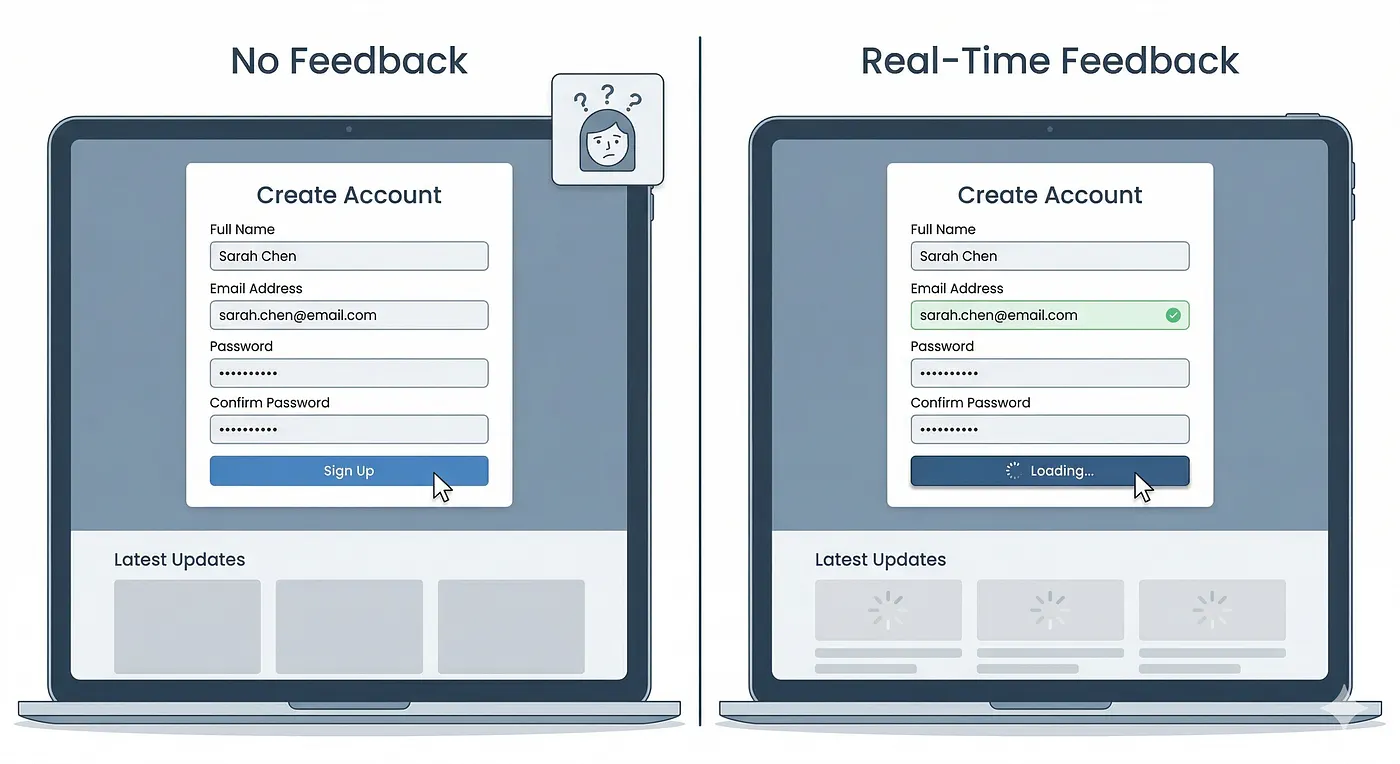
2. Real-Time Feedback Everywhere
Users have stopped tolerating the gap between action and response. Not the network latency — that’s expected. The design gap. The moment where you click something and nothing visible happens for two seconds. Where you submit a form and wait for the page to reload to know it worked.
Instant validation, skeleton loaders, live search, optimistic UI — these aren’t just nice-to-haves anymore. According to FullStack Labs’ 2025 UX research, users now interpret delayed feedback as broken, not loading. The tolerance window has collapsed.
The practical shift is designing the feedback first. What does the user see in the 200ms between click and server response? If the answer is “nothing,” that’s a design problem waiting to become a support ticket.
3. Invisible UI (Less Buttons, More Flow)
The best interfaces are the ones users don’t notice. Not because they’re hidden, but because they’re so well-aligned with what the user is trying to do that the interface stops being a barrier.
This shows up in gestures replacing taps, smart defaults reducing choices, auto-suggestions replacing blank inputs. Raycast — the Mac productivity tool — is a good real example: it’s almost entirely keyboard-driven, there are very few visible buttons, and yet new users figure it out without instructions because the flow is obvious.
According to UX Studio’s 2025–2026 trend analysis, Zero-UI and gesture-based interaction are expanding beyond wearables into mainstream apps, especially as voice and contextual interfaces mature. The pattern isn’t removing UI — it’s designing UI that steps aside at the right moment.
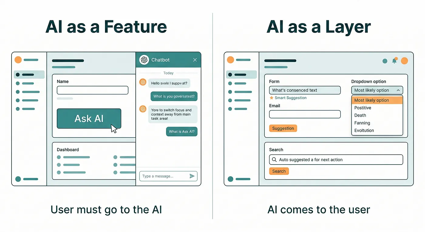
4. AI as a Layer, Not a Feature
The AI integrations that are actually improving products in 2025 aren’t chatbots bolted onto a sidebar. They’re AI working quietly in the background: auto-completing form fields based on past behavior, surfacing the right filter before the user searches for it, adapting the interface based on what the user has done before.
This is the distinction worth paying attention to. AI as a feature asks for attention — there’s a button, a panel, a prompt. AI as a layer removes friction without announcing itself. You notice it’s gone, not that it was ever there.
Pixelmatters’ 2025 design report noted that many products are still pushing AI before it’s ready, shipping half-baked features that add steps instead of removing them. The best AI in UI right now is the AI users don’t realize they’re using.
5. Micro-Interactions That Communicate, Not Decorate
The micro-interactions worth copying aren’t the ones that look satisfying. They’re the ones that reduce doubt.
When you drag a file to trash on macOS, the trash icon bulges slightly. When you archive an email in Gmail, there’s a brief color shift and a quick undo prompt. These aren’t decorative. They confirm the action happened and give you a way out if it didn’t. They communicate system state without requiring a modal or a notification.
According to Appnova’s 2025 UI trends research, effective micro-interactions in 2025 are less about delight and more about reducing friction: a gentle input shake instead of a red error banner, a morphing icon that shows state change, a button that visually changes the moment it’s clicked. The measure isn’t “does it look good?” It’s “does the user know what just happened?”
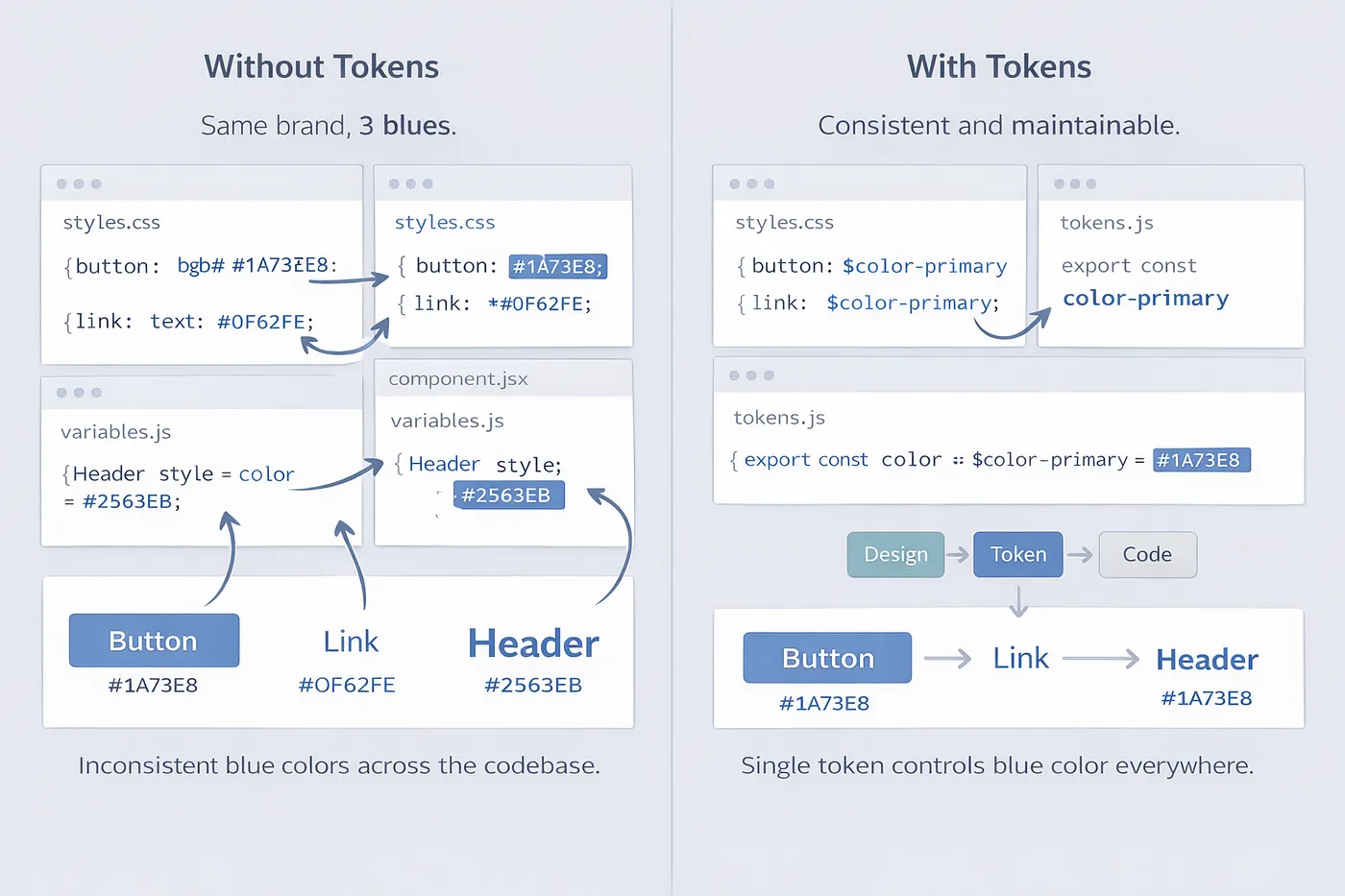
6. Design Systems Getting Serious About Tokens
Design tokens have been talked about for years. In 2025, they’re actually being adopted. The Design Systems Report 2025 found that 84% of teams have adopted design tokens, up from 56% in 2024. That’s not a gradual shift — that’s mass adoption happening in 12 months.
What changed is the tooling. Figma Variables made token management practical for designers, not just developers. The W3C Design Tokens Community Group published its first stable specification in October 2025, with over ten tools already implementing it. The pipeline from design to code got shorter.
The outcome isn’t visual consistency — though that follows. It’s speed. Sparkbox’s 2024 research found that design system adoption accelerates form development by 47%. Headspace reported 20–30% time savings on routine tasks after fully implementing tokens and variables. The system isn’t about making things look the same. It’s about making things faster to build correctly.
7. Data-Dense but Actually Readable
There’s a design habit that treats complexity as the enemy — hide it, collapse it, paginate it away. The result is interfaces where users can’t see what they need without clicking through several layers.
The shift happening in analytics and enterprise tools in particular is different: show more data, but structure it better. Better typographic hierarchy. Clearer grouping. Progressive disclosure that reveals detail when you want it, not that buries information by default.
The Baymard Institute’s research is consistent on this: users don’t want less data. They want data that’s easier to read. The move is from “less is more” to “clarity is more.” Dense and readable isn’t a contradiction — it’s a design challenge worth solving.
8. Personalization That Doesn’t Overreach
The worst personalization is the kind that makes users feel watched. The best is the kind that makes the interface feel like it was built for them without requiring them to notice it.
Smart defaults — filling in the city field based on location, remembering filter settings, showing recently used actions at the top — feel helpful. Dynamically rearranging the entire layout based on behavioral prediction often feels unstable. Users lose their sense of where things are, which creates the opposite of comfort.
FullStack Labs’ 2025 UX analysis identified this boundary clearly: personalization that adapts content within a stable structure works. Personalization that changes structure based on behavior usually backfires. The lesson is that adaptive UI and predictable UI aren’t competing goals — users need both at the same time.
The Common Thread
Most of these trends point at the same thing: the interface is getting out of the way.
Not because minimalism is fashionable. Because users have built habits around speed. They don’t read — they scan. They don’t wait — they interpret silence as broken. They don’t learn apps — they expect apps to accommodate them.
The trends worth following are the ones that respond to those behaviors with real design decisions, not aesthetic choices. The ones that show up in how quickly users complete tasks, not how many awards the app wins.
Not every trend on this list will land for every product. But all of them are based on how people actually use interfaces now — and that’s a better starting point than how interfaces look on Dribbble.
If this was useful, follow me here. I write about UI, UX, and the mechanics of building things for the web — the stuff worth knowing, not just worth bookmarking.