Casinos figured it out decades before the app store did
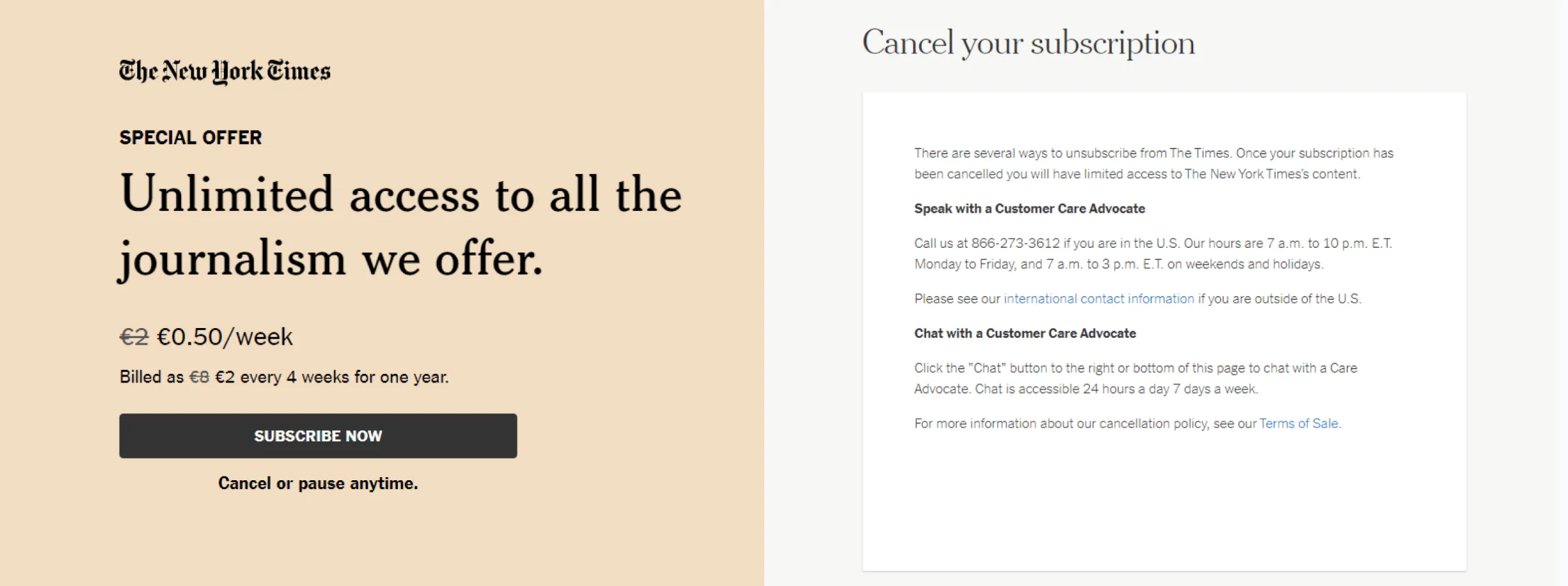
I tried to cancel a web service recently. I won’t name them, partly because I don’t want to give them the attention, and partly because it could have been any of a hundred companies.
Here is exactly what happened:
- I had to hunt for the cancel option (not in settings where I expected it; eventually found it buried in a support menu)
- When I found it, there were multiple confusing options: “pause,” “downgrade,” “change plan,” and somewhere in there, cancel
- I was asked why I was leaving and could not skip the question
- Before processing anything, the system offered me 70% off to stay
- After I declined that, I was told I needed to call customer service to complete the cancellation
- Customer service walked me through the exact same process again, with several warnings about how my data would be unrecoverable after I left
That last step is the one that really got me. If calling was always required to cancel, why didn’t they just say “call to cancel” upfront? The answer, of course, is that they did not want me to cancel. Every step was designed to wear me down, confuse me, or frighten me into staying.
This is a roach motel. Easy to check in, very hard to check out.

Vegas Got There First
Casinos have been doing this for a very long time, and they did it without a single line of code.
Walk into almost any major casino and you will notice a few things immediately: there are no clocks on the walls, the windows are either absent or blacked out, the exits are not obvious, and the layout is deliberately labyrinthine. Getting to the buffet requires walking past three poker rooms and a wall of slot machines. Cashing out your chips involves finding a specific window and waiting in line.
None of this is accidental. It took architects, interior designers, and behavioral scientists working together to make leaving feel harder than staying.
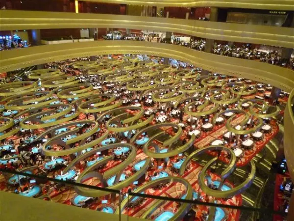
Overhead shot of a casino layout, designed to keep gamblers inside
The slot machine gets all the attention when we talk about casino manipulation, and deservedly so; it is a masterwork of psychological engineering. But the humble “we hid the exit” is just as effective, and it requires almost no sophistication at all. It’s purely structural friction.
The Invisible Majority of Dark Patterns
When designers and journalists talk about dark patterns, we tend to reach for the dramatic examples: infinite scroll, loot boxes, variable reward schedules, obfuscated currencies. These are real and worth discussing. But they require genuine craft to execute well. Someone had to think hard about the psychology, run the A/B tests, iterate on the timing.
The cancellation flow I described required none of that. Someone simply asked: “what if we made every step of this a little bit harder?” And then they did it. No behavioral science degree required.
This is worth naming, because I think it lets a lot of companies off the hook. “We’re not doing anything like what those big manipulative apps do.” Maybe not. But if your cancellation process has six steps and one of them is a mandatory phone call, you are absolutely doing something like what casinos do. You are hiding the exit.
The scale of this is enormous. Virtually every subscription business with a difficult cancellation process is running this same playbook. It is the most prevalent dark pattern in existence, and it rarely makes the list when we catalog the bad behaviors of tech companies.
What It Costs You
Beyond the ethical problem, this is also a business mistake.
Customers who feel trapped tend to share that feeling. The experience I described above ended with me writing this article, which is perhaps not the outcome they were hoping for. More broadly, every user who cancels feeling frustrated is a user who will not recommend you, who might actively warn others away, and who will certainly never come back.
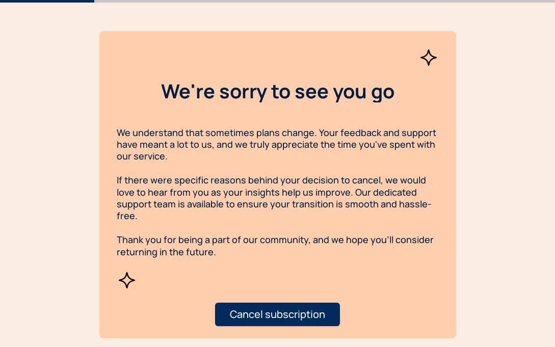
Maybe this should be called the “No hard feelings” cancelation screen?
Compare that to a graceful offboarding. Acknowledge the cancellation clearly. Make it fast. Maybe offer the discount upfront, before the user has already decided to leave and resents the offer. Let them download their data easily. Thank them genuinely.
The companies that do this well understand something important: a user who leaves feeling respected is far more valuable than a user who stays feeling trapped. One of them might come back someday, or send you their friends. The other is just counting down until they can find an alternative.
If You’re Building a Product
Audit your cancellation flow the way you would audit your onboarding. Time it. Count the steps. Ask someone who doesn’t work at your company to try to cancel a test account, and watch what they do.
If the process takes longer than two minutes or more than three steps, you have some version of a roach motel. The good news is that it’s a design problem, and design problems have solutions. Unlike a casino, you can choose to build the exits in plain sight.
Sam Liberty is a gamification expert, applied game designer, and consultant. His clients include The World Bank, Click Therapeutics, and DARPA. He teaches game design at Northeastern University and is a Civic Media Scholar at University of Southern California.