You don’t need a team of 20 or a six-month roadmap. You need one focused weekend and a CSS file.
Six months into building my side project, I had a problem I kept ignoring.
Every time I needed a new button, I was writing button styles from scratch. Every new card component had slightly different padding than the last one. My grays were all slightly different shades — #666, #6b6b6b, #707070 — scattered across a dozen files, none of them consistent. The product worked fine. But every new page took longer than it should have, and every design decision felt like it was being made for the first time.
The fix wasn’t complicated. It was just a CSS file with variables I’d committed to actually using.
That’s the core of a design system for a solo developer or small team. Not Figma tokens synced to a CI pipeline. Not a Storybook instance with 200 documented components. Just a set of decisions written down in one place that every component in your project actually references.
Here’s how to build it in a weekend.
Why most solo devs skip it (and pay for it later)
The standard reason is time. A design system feels like infrastructure work — the kind of thing you do when the project is “big enough.” So you ship fast, make local decisions, and move on.
The cost shows up quietly. A Sparkbox research report found that teams with a design system spend 47% less time on form development than teams without one. That gap compounds: every component you build without a system creates a slightly different precedent. After six months, you have fifteen different button variants and no clear rule for which to use when.
The other cost is harder to measure: decision fatigue. Without a system, every new UI element requires you to answer the same questions again — how much padding? Which font size? What border radius? A design system answers those questions once. After that, you stop deciding and start building.
The weekend investment pays for itself on the next feature you ship.
The minimum viable design system
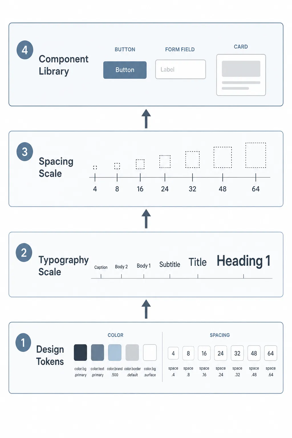
You don’t need to boil the ocean. A working design system for a solo dev or small team needs exactly four things:
Design tokens — your raw values. Colors, spacing, border radii, font sizes. These are the primitives everything else references.
Typography scale — a defined set of sizes and weights for headings, body text, captions, and labels. Not infinite options. A fixed set.
Spacing scale — a consistent rhythm for padding, margin, and gaps. The most common approach is an 8px base unit with a defined scale: 4, 8, 16, 24, 32, 48, 64.
Component library — buttons, forms, and cards to start. Not everything — just the three components you reach for on every single project.
That’s it. Everything else can wait until you actually need it.
CSS custom properties as the backbone
You don’t need Style Dictionary or Theo or any build tooling to start. A well-structured CSS file with custom properties is the right starting point for a solo project or small team.
Here’s what a real tokens file looks like:
/* tokens.css */
:root {
  /* Colors — primitives */
  --blue-500: #2563eb;
  --blue-600: #1d4ed8;
  --gray-100: #f3f4f6;
  --gray-700: #374151;
  --gray-900: #111827;
  --red-500: #ef4444;
  --white: #ffffff;
/* Colors — semantic */
  --color-primary: var(--blue-500);
  --color-primary-hover: var(--blue-600);
  --color-text: var(--gray-900);
  --color-text-muted: var(--gray-700);
  --color-surface: var(--gray-100);
  --color-error: var(--red-500);  /* Spacing */
  --space-1: 0.25rem;   /* 4px */
  --space-2: 0.5rem;    /* 8px */
  --space-3: 0.75rem;   /* 12px */
  --space-4: 1rem;      /* 16px */
  --space-6: 1.5rem;    /* 24px */
  --space-8: 2rem;      /* 32px */
  --space-12: 3rem;     /* 48px */  /* Typography */
  --font-size-sm: 0.875rem;
  --font-size-base: 1rem;
  --font-size-lg: 1.125rem;
  --font-size-xl: 1.25rem;
  --font-size-2xl: 1.5rem;
  --font-size-3xl: 1.875rem;
  --font-weight-normal: 400;
  --font-weight-medium: 500;
  --font-weight-bold: 700;
  --line-height-tight: 1.25;
  --line-height-normal: 1.5;  /* Border */
  --radius-sm: 4px;
  --radius-md: 6px;
  --radius-lg: 8px;
  --radius-full: 9999px;
}
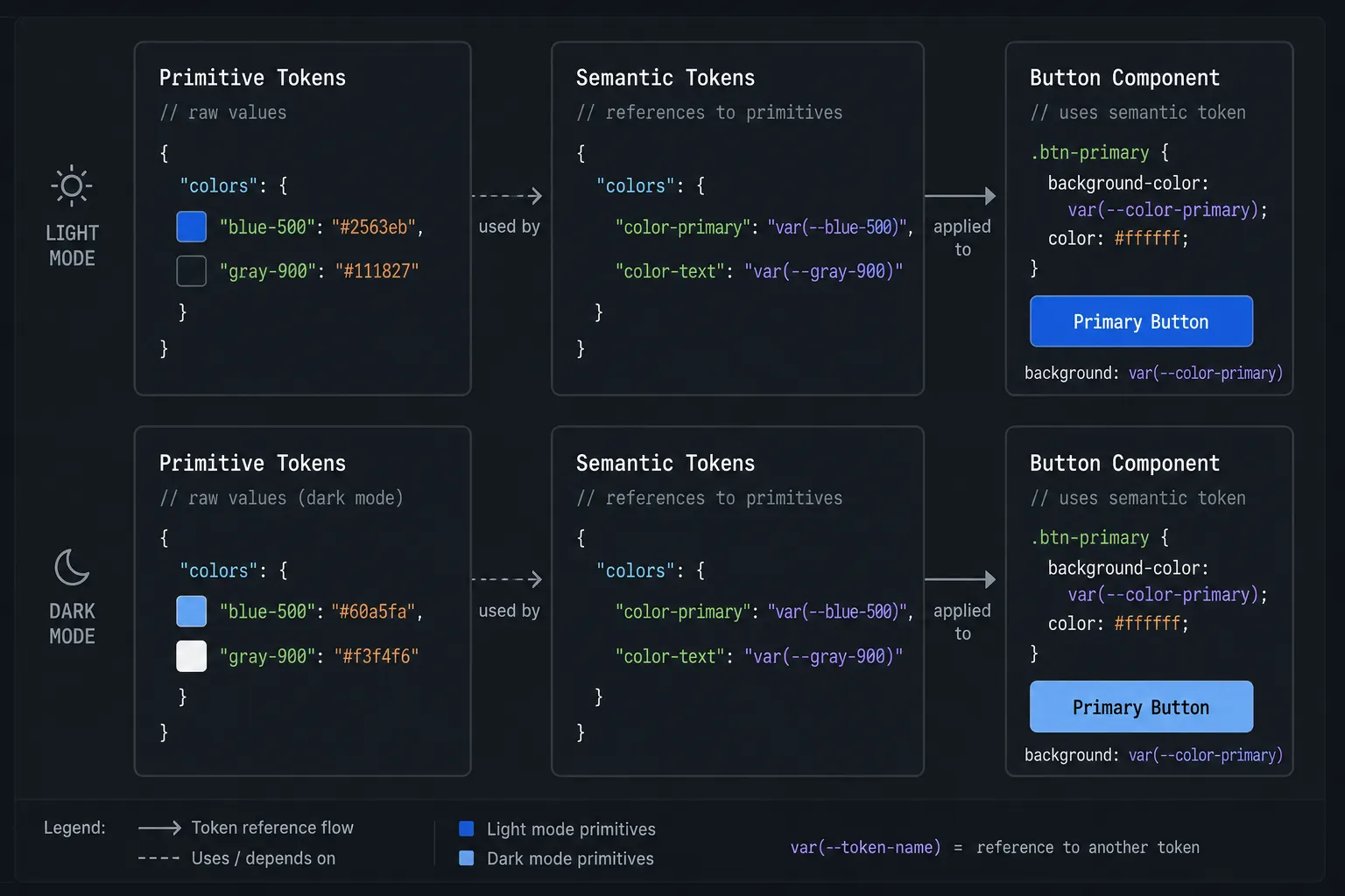
The two-layer approach — primitives (--blue-500) and semantic tokens (--color-primary) — is worth doing from the start. According to design.dev's 2025 design systems guide, separating primitive values from semantic tokens is what makes theming possible later. When you want to add dark mode, you only change the semantic layer. The primitives stay the same, the components stay the same — you just remap what --color-primary points to.
CSS custom properties work at runtime, which means they update without a build step and can be modified with JavaScript. They support theme switching, respond to user preferences, and cascade naturally through your component tree — none of which is possible with Sass variables, which compile out before the browser ever sees them.
Import this file at the top of your main stylesheet and every component you write has immediate access to every token.
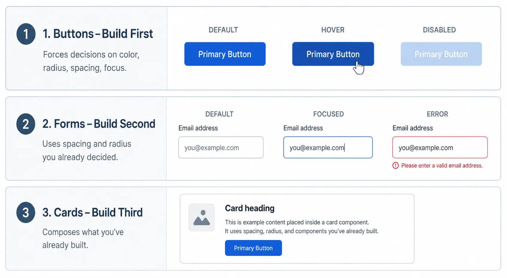
What to build first: buttons, forms, cards — in that order
Buttons first. Every project has buttons. They’re the most touched component in any UI, and they exist in the most states — default, hover, focus, active, disabled, loading. Getting them right forces you to make decisions about your color tokens, your border radius, your spacing scale, and your focus ring style all at once. Building buttons first sets the visual language for everything that follows.
.btn {
  display: inline-flex;
  align-items: center;
  gap: var(--space-2);
  padding: var(--space-2) var(--space-4);
  font-size: var(--font-size-base);
  font-weight: var(--font-weight-medium);
  border-radius: var(--radius-md);
  border: none;
  cursor: pointer;
  transition: background-color 0.15s ease;
}
.btn-primary {
  background: var(--color-primary);
  color: var(--white);
}.btn-primary:hover {
  background: var(--color-primary-hover);
}.btn-primary:focus-visible {
  outline: 2px solid var(--color-primary);
  outline-offset: 2px;
}.btn-primary:disabled {
  opacity: 0.5;
  cursor: not-allowed;
}
Notice every value is a token. No hardcoded colors. No magic numbers. If your brand color changes, you update one line in tokens.css and the button updates everywhere.
Forms second. Forms are where visual inconsistency causes the most user friction. Input fields, labels, error states, help text — these need to feel coherent, and they use a different set of decisions than buttons. Building forms after buttons means you’ve already settled your spacing scale and border radius conventions, so the form components feel related without you having to force it.
Cards third. Cards are the most generic container pattern. They compose buttons and sometimes contain form elements, which is why they come last — you want to build them after the components that often live inside them. Cards also establish your surface color and shadow conventions, which feed back into the rest of the system.
How to document it so future-you actually uses it
Documentation is the part solo developers skip most often, and then regret six months later when they can’t remember why they picked --radius-md: 6px or which spacing value to use for component padding vs. layout padding.
The minimum documentation that actually gets used isn’t a Storybook instance. It’s a single HTML file — design-system.html — that imports your tokens.css and renders every token and component visually. No framework required. Just a page you can open in a browser that shows you what everything looks like and what to call it.
Structure it in sections:
Colors — every semantic token displayed as a color swatch with its name and current value underneath. When you’re working and can’t remember the name of your muted text color, you open this page, see it, and copy the token name.
Typography — each size token displayed with real text at that size. “Heading 1” in --font-size-3xl at --font-weight-bold. "Body" in --font-size-base at --font-weight-normal. Visual reference beats reading a list of rem values every time.
Spacing — a visual scale showing each spacing value as a colored bar of that width or height. The 8px base unit system becomes immediately intuitive when you can see the rhythm.
Components — each component in all its states, all in one place. Button: default, hover, disabled. Input: empty, focused, error. Card: default.
That file becomes your reference document. You open it the same way you’d open a Figma file — to remember decisions you already made rather than re-making them.
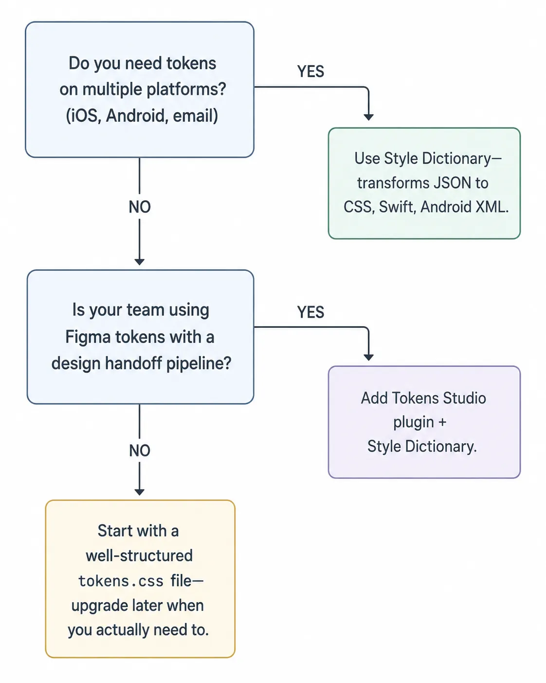
When to bring in tooling
A structured CSS file is the right starting point. When to add more:
Style Dictionary is worth adding when you need to share tokens across platforms — web, iOS, Android, or email. It takes JSON token definitions and outputs platform-specific formats: CSS custom properties, Sass variables, Swift asset catalogs, Android XML. For a solo web project, it’s probably overkill. For a project that has both a web app and a React Native app, it earns its setup time quickly.
Theo (by Salesforce) works similarly to Style Dictionary and has a slightly simpler configuration syntax. It’s less actively maintained as of 2025 but still functional for teams that adopted it early and don’t need to switch.
Just a well-structured CSS file is the right answer for most solo projects and small teams. According to the 2024 State of Design Systems report by Specify, 74% of mature design systems use tokens as their primary method for distributing design decisions — but the format those tokens live in doesn’t matter as much as the discipline of actually using them consistently.
The tooling question is secondary to the discipline question. A JSON pipeline that half the team ignores is worse than a CSS file that everyone actually imports and references.
The weekend plan
Saturday morning (2–3 hours): Create tokens.css. Define your color primitives and semantic tokens. Define your spacing scale and typography scale. Commit to it — no more hardcoded values after this.
Saturday afternoon (3–4 hours): Build your button component. All states. Every value a token.
Sunday morning (2–3 hours): Build your form components. Input, label, error state, help text.
Sunday afternoon (2 hours): Build your card component. Start design-system.html — just colors and typography for now.
Sunday evening (1 hour): Add components to design-system.html. Commit everything. Done.
That’s it. You now have a design system that will save you time on every single feature you build after this. Not because it’s elaborate — because it’s consistent.
If this helped you, follow me here. I write about frontend development and the practical decisions that separate projects that are easy to work in from ones that slowly become impossible to maintain.