Most products don’t look cheap because of bad design.
They look cheap because of tiny decisions nobody paid attention to.
That’s the painful part.
You can have a clean layout, a modern font, nice colors, smooth animations, and still end up with a product that somehow feels like it was built during a stressful weekend.
That’s also why tools like MadeinFigma exist in the first place. Not to replace designers, but to help them skip the messy parts and focus on polished designs.
Premium products rarely scream.
They whisper.
You use them and immediately think, “Yeah… someone cared.”
What’s funny is that the difference between “this feels premium” and “this feels unfinished” is often ridiculously small.
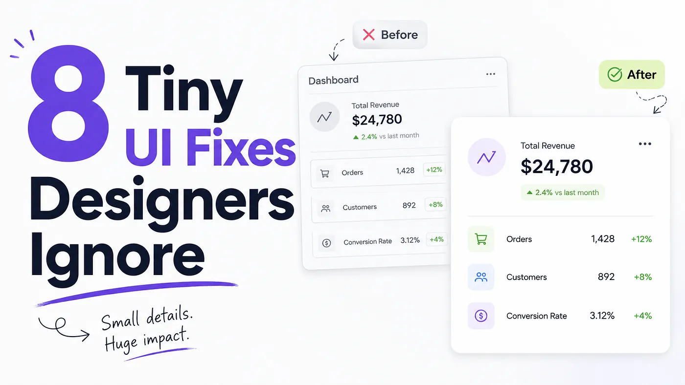
So here are 8 tiny UI details that quietly make products feel far more polished than they actually are.
And yes, some of these are so subtle your users will never consciously notice them.
That’s exactly the point.
1. Stop making everything the same weight
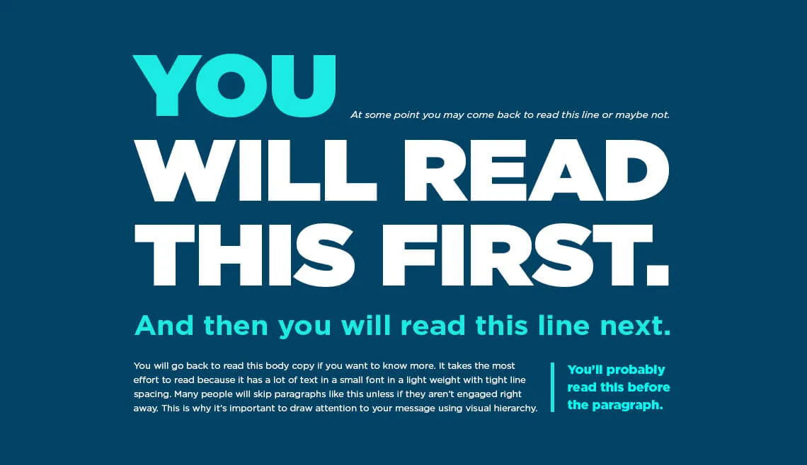
One of the fastest ways to make a UI feel amateur is giving everything equal visual importance.
Same font weight.
Same opacity.
Same spacing.
Same button intensity.
Same energy.
Your interface starts looking like a group project where nobody wanted to hurt each other’s feelings.
Premium products understand hierarchy.
They know what should dominate the screen and what should politely shut up.
Try this:
- Reduce secondary text opacity
- Make tertiary actions quieter
- Use fewer bold labels
- Let headlines breathe
- Stop outlining every single card like it owes you money
Good UI isn’t about adding emphasis.
It’s about removing unnecessary emphasis.
2. Increase padding until it feels slightly wrong
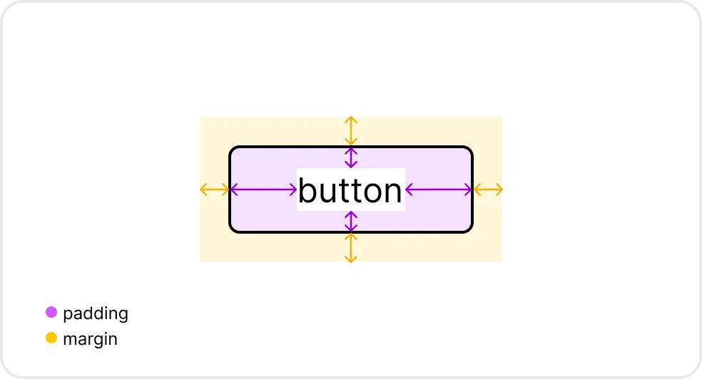
Most interfaces are too tight.
Designers constantly underestimate spacing because our brains adapt too quickly while zoomed in at 200%.
Then you preview it normally and suddenly your dashboard feels like every passenger trying to board a flight at the same time.
Premium products almost always have more breathing room than you expect.
Not dramatically more.
Just enough.
The weird trick:
Increase padding until it feels slightly excessive.
That’s usually the correct amount.
3. Your border radius is probably fighting itself
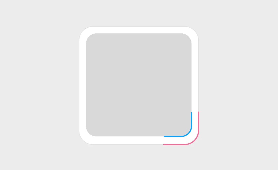
This one quietly destroys visual consistency.
You’ve got:
- 6px buttons
- 12px cards
- 20px modals
- fully rounded inputs
- random pill tags
Everything looks like it came from different websites that accidentally met each other.
Premium interfaces usually have a radius system.
Not chaos.
Even if users never notice it consciously, consistency creates trust.
And trust creates perceived quality.
Pick a radius scale and commit to it.
4. Perfect alignment feels weirdly luxurious
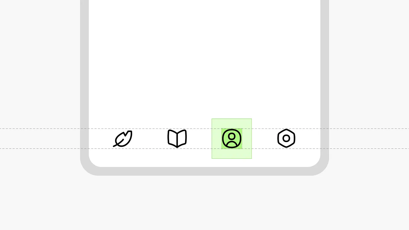
Humans are unbelievably sensitive to alignment.
One icon being 2 pixels off can make an entire product feel sloppy without users knowing why.
The scary part?
Once you start noticing bad alignment, you can never unsee it again.
You’ll open apps and wonder, “Why is that toggle not centered?”
Premium interfaces obsess over invisible alignment:
- Icon optical balance
- Text baselines
- Spacing consistency
- Button heights
- Label positioning
- Avatar placement
It’s the design equivalent of tailoring a suit.
Nobody notices immediately.
But everybody feels it.
muzli new tab
5. Use fewer colors than you think you need
Cheap products often look like they’re trying very hard to look designed.
Which usually means:
- Too many accent colors
- Too many gradients
- Too many highlights
- Too many “look at me” moments
Premium products tend to feel restrained. Confident.
A lot of the best interfaces rely heavily on neutrals and let one accent color do the heavy lifting.
That restraint creates sophistication.
It’s the same reason luxury fashion brands don’t print rainbow gradients on everything they make.
Minimal color usage creates focus.
Focus creates clarity.
Clarity feels expensive.
6. Animation should feel helpful, not athletic
Some interfaces animate like they’re auditioning for a Marvel movie.
Every panel slides.
Every button bounces.
Every modal performs a full theatrical entrance.
Meanwhile the user just wanted to update their billing address.
Good animation should reduce friction, not announce itself.
Premium motion design usually feels:
- Fast
- Subtle
- Intentional
- Almost invisible
The user shouldn’t think,
“Wow, cool animation.”
They should think:
“That felt smooth.”
Huge difference.
7. Tiny delays can make products feel smarter
This one sounds weird until you notice it.
Sometimes instant feedback actually feels less premium.
For example:
- Dropdown appears too fast
- Tooltip flashes aggressively
- Success state disappears instantly
- Hover transitions snap harshly
Micro delays create softness.
Softness creates polish.
There’s a reason luxury car doors don’t sound like empty soda cans when they close.
Digital products work the same way.
Tiny timing adjustments create perceived quality.
Not because users measure them.
Because humans emotionally feel rhythm before they intellectually process it.
8. Premium products remove more than they add
This is probably the biggest difference of all.
Cheap interfaces try to impress you by adding things.
Premium interfaces impress you by removing things.
Fewer labels.
Fewer dividers.
Fewer notifications.
Fewer colors.
Fewer competing actions.
Confidence in UI design often looks like restraint.
And honestly?
A lot of products don’t need another feature.
They need someone brave enough to delete three.
Final thoughts
Users are incredibly good at sensing quality.
Even when they can’t explain it.
Nobody opens a beautifully designed product and says:
“Ah yes, the 8-point spacing system and carefully managed visual hierarchy are excellent.”
They just feel it.
That feeling is what separates products people tolerate from products people trust.
And weirdly enough, the gap is usually built from tiny decisions nobody talks about.
Not giant redesigns.
Not trendy gradients.
Not another glassmorphism experiment that somehow melted your CPU.
Just details.
Tiny, obsessive, slightly unhealthy details.
……
💡 Stay inspired every day with Muzli!
Follow us for a daily stream of design, creativity, and innovation.
Linkedin | Instagram | Twitter
Stay inspired every day with Muzli!