There’s a quiet game happening in product design. Every time a SaaS product launches, a pattern gets scrutinized, reverse-engineered, and quietly borrowed by designers everywhere.
This isn’t plagiarism. It’s how the craft moves forward.
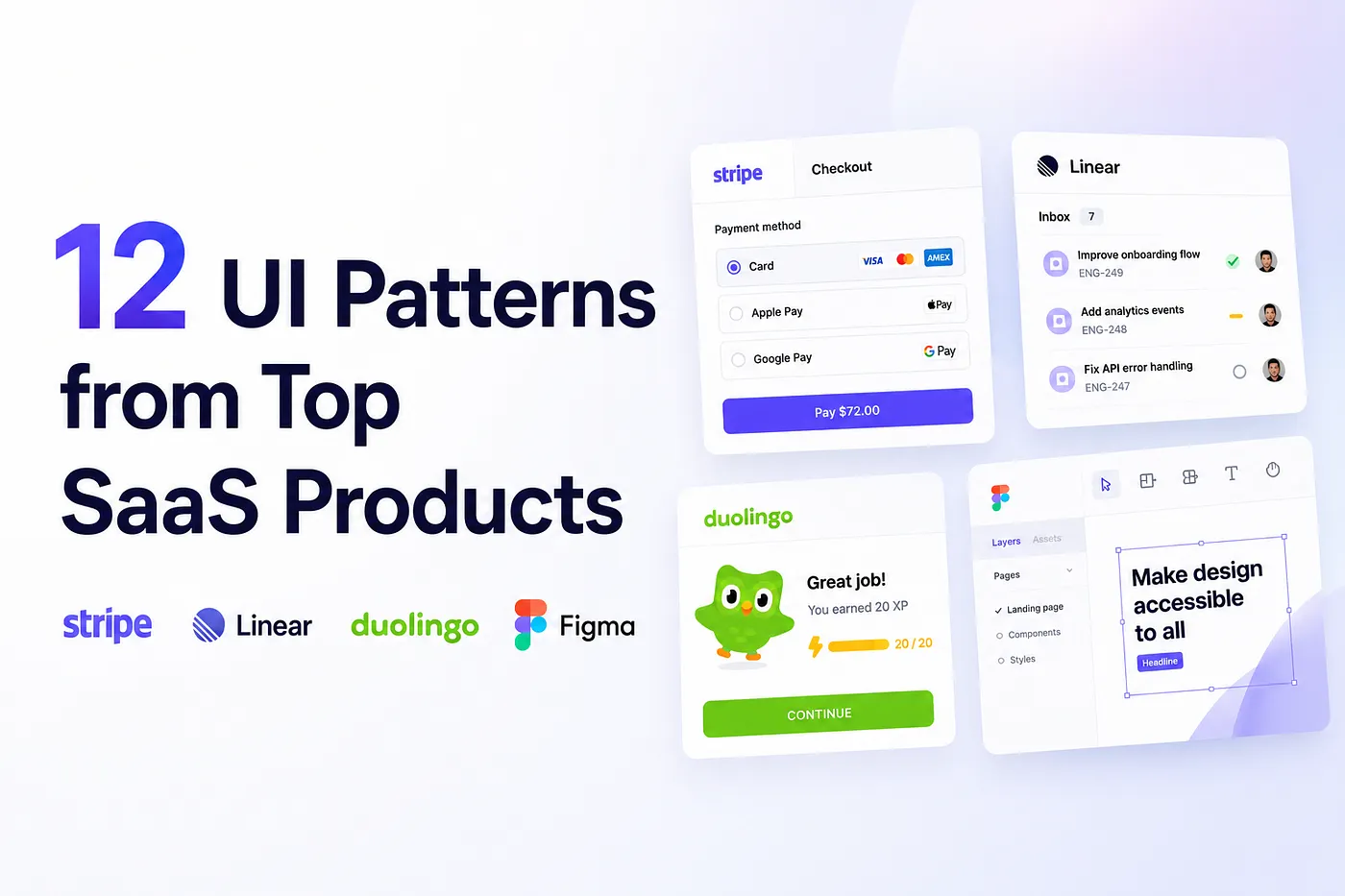
The best SaaS products — Notion, Linear, Stripe, Figma, Loom, Intercom — didn’t just build great software. They built great UI systems. Patterns that reduce cognitive load, increase trust, nudge users forward, and make a product feel premium without being showy.
In this article, I’ll break down the 12 most copied UI patterns from top-tier SaaS products, why they work from a UX science perspective, and how you can implement them in your own design work.
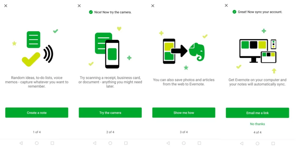
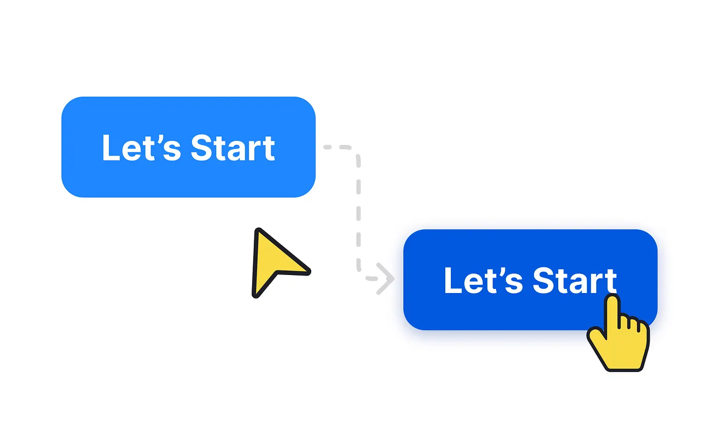
1. Progressive Onboarding (Not a Feature Tour)
Seen in: Notion, Duolingo, Linear, Figma
img credit: user onboarding academy
Most products used to greet new users with a 12-step feature tour. Nobody finished it. Nobody liked it.
The shift has been toward progressive onboarding — revealing the product’s complexity in layers, letting users experience value before they understand the full feature set.
Instead of “here’s everything we can do,” it’s “here’s the one thing that’ll make your first 5 minutes worth it.”
Why it works: Cognitive Load Theory tells us the brain can only process a limited amount of information at once. When users are presented with too much upfront, they freeze or leave. Nielsen’s principle of progressive disclosure — hiding advanced functionality until it’s needed — reduces this overload dramatically.
90% of users churn without strong onboarding. Products with guided empty states see 28% less confusion in early sessions.
What to copy: Break onboarding into a short, goal-oriented sequence. Ask users what they want to achieve before showing them features. Notion does this brilliantly — it asks whether you’re using it for personal, team, or company use, then tailors the experience immediately.
2. The Empty State as a Conversion Moment
Seen in: Slack, Airtable, Linear, Intercom
Empty states are one of the most underrated real estate in SaaS UI. Most products treat them as an afterthought — a grey box with “No items yet.”
Top products treat them as a first impression and a call to action.
Slack’s empty DM screen prompts you to message a teammate. Airtable’s empty table walks you through creating your first record. Linear’s empty project view suggests importing issues. Each empty state is designed to pull users forward rather than leave them stranded.
Why it works: Users who hit an empty state are at peak motivation — they just signed up, they just created a project, they want something to happen. That’s the perfect moment to guide them toward their first meaningful action.
Products with helpful empty states see 28% less user confusion. A blank screen is a lost opportunity that costs you activation.
What to copy: Every empty state needs three things — a clear illustration or icon, a single-sentence explanation of what belongs here, and one CTA to fill it. Don’t add two CTAs. Don’t explain every feature. One action, one moment.
3. Inline Validation (Not Post-Submit Errors)
Seen in: Stripe, GitHub, Shopify, Intercom
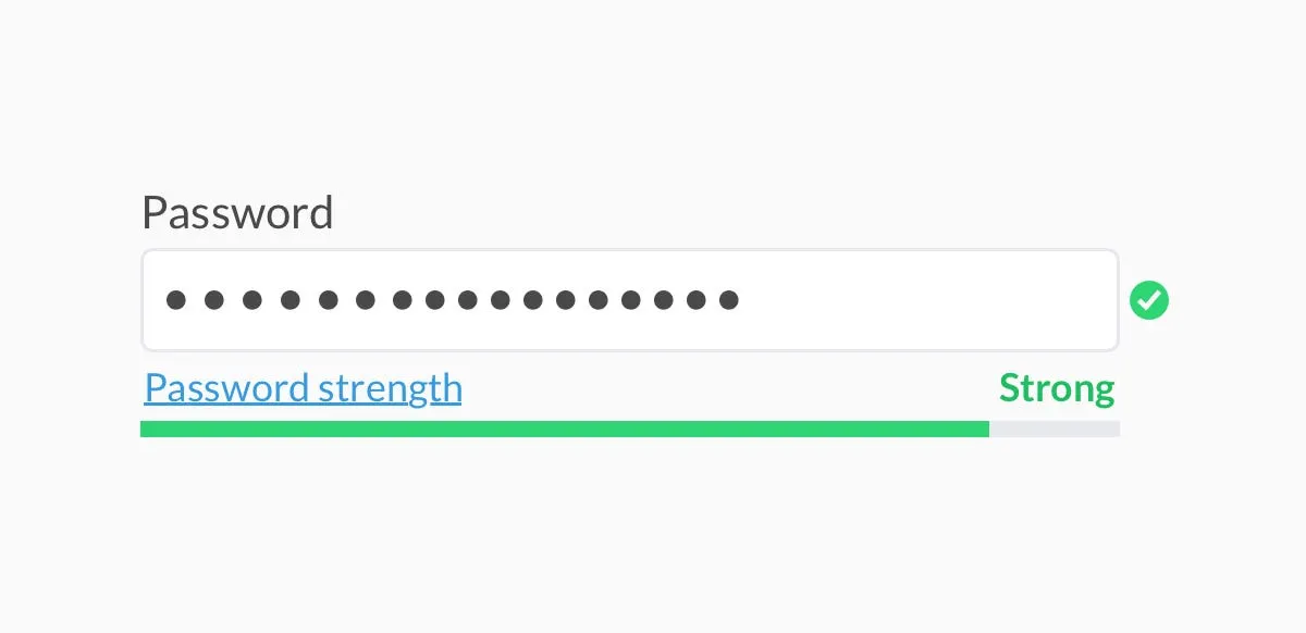
Nothing kills conversion more reliably than a form error that appears after the user hits submit. The user has to scroll back up, find the red fields, fix them, and try again — while their motivation drains with every extra step.
Inline validation changed this. As users type, they see immediate feedback. Green check for a valid email. Red underline with a helpful note for a weak password. The error is resolved in the moment, not discovered at the end.
Why it works: It removes the psychological sting of failure. When feedback is immediate, it feels like guidance rather than rejection. The user feels supported, not judged.
E-commerce sites currently see cart abandonment rates of approximately 71%, with many cases directly tied to UX friction at form stages. Inline validation directly addresses this friction point.
What to copy: Validate on blur (when the user leaves the field), not on keypress. Validating while someone is still typing is annoying. Wait until they're done with a field, then give your feedback. Make error messages specific — "Password must be at least 8 characters" beats "Invalid password" every time.
muzli new tab
4. Command Palettes (The Power User Shortcut)
Seen in: Linear, Notion, Vercel, Figma, Raycast
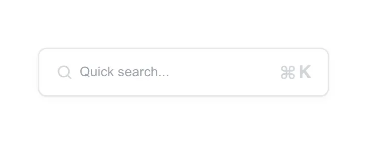
Linear popularized this pattern for SaaS, but it’s now everywhere. Press ⌘K and a search-first navigation palette appears. Users can type anything — "create issue," "invite team member," "open settings" — and jump there instantly.
It’s the bridge between beginner navigation (menus) and expert navigation (keyboard-first workflows).
Why it works: It collapses navigation complexity without hiding it. Power users get speed; new users still have the sidebar. The command palette doesn’t replace navigation — it augments it. It also satisfies the growing expectation that SaaS tools should feel as fast as native desktop apps.
The SaaS market is projected to surpass $307 billion globally by 2026, with users increasingly choosing products that feel fast and frictionless over those with more features. Speed is now a UX differentiator.
What to copy: Add ⌘K support to your product — there are open-source libraries like cmdk (React) that make this relatively fast to implement. Surface the shortcut visibly in your nav so users discover it. Include actions, not just navigation links, in the palette.
5. Contextual Tooltips (Not Documentation)
Seen in: HubSpot, Intercom, Pendo, Figma
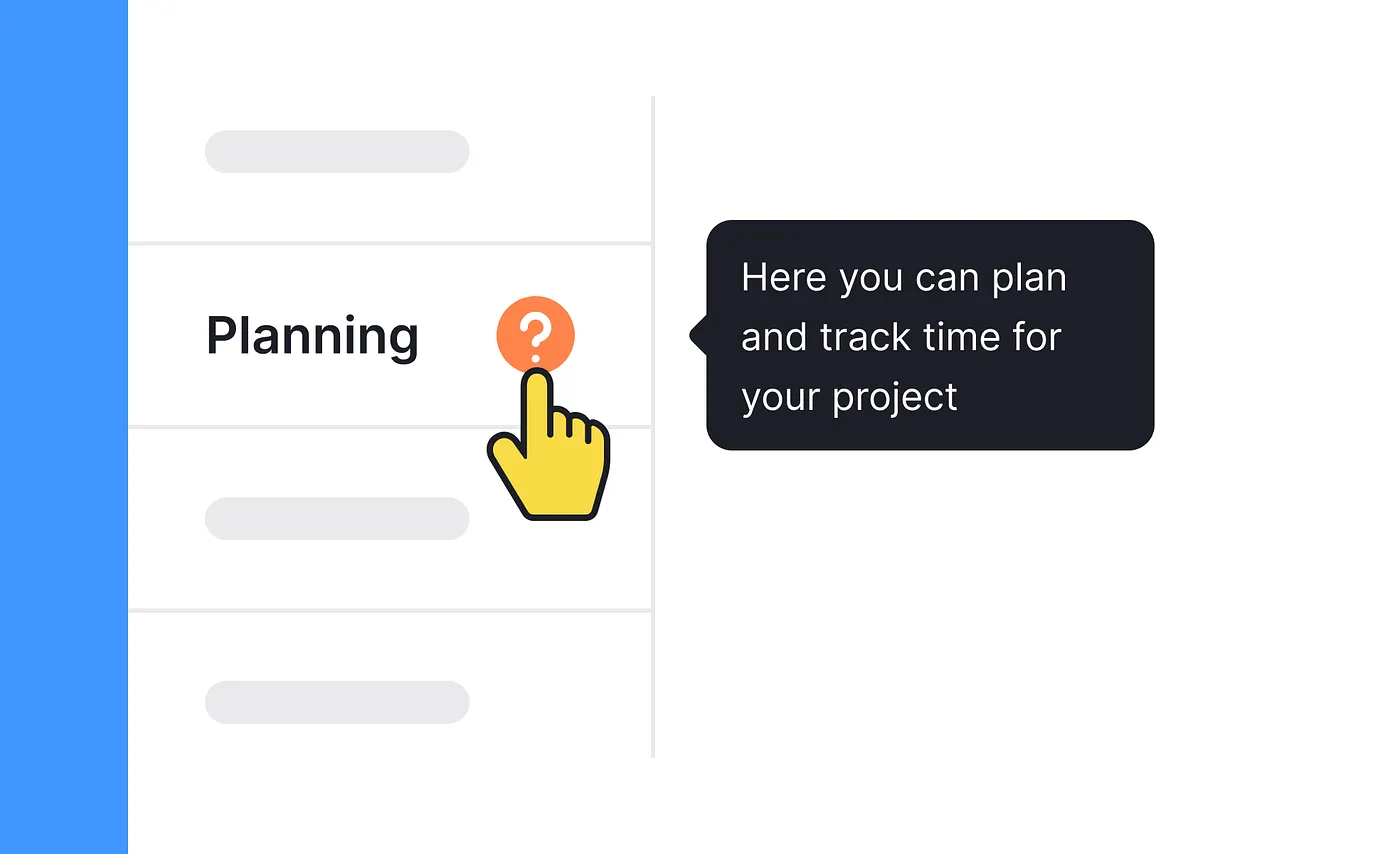
img credit: uxcel
The old way: write documentation, hope users find it, watch them churn when they don’t.
The new way: surface help exactly where the confusion happens.
Contextual tooltips appear in-product, triggered by hover or a small ? icon, right next to the element they explain. They don't take users away from the page. They answer the question users have right now, in three sentences or fewer.
Why it works: People don’t read documentation in advance — they read it at the moment of confusion. Contextual help meets users at that moment without breaking their flow. It’s the difference between a sign on a door (“pull”) versus a brochure in the lobby about how doors work.
Contextual help buttons reduce support queries by 40%. That’s a measurable reduction in support overhead from a UI pattern, not a product feature.
What to copy: Keep tooltips under 30 words. They should explain the why of a feature, not just repeat the label. “Workspace” as a label plus “Your workspace is shared with your whole team. Personal spaces are private.” as a tooltip — that’s the format.
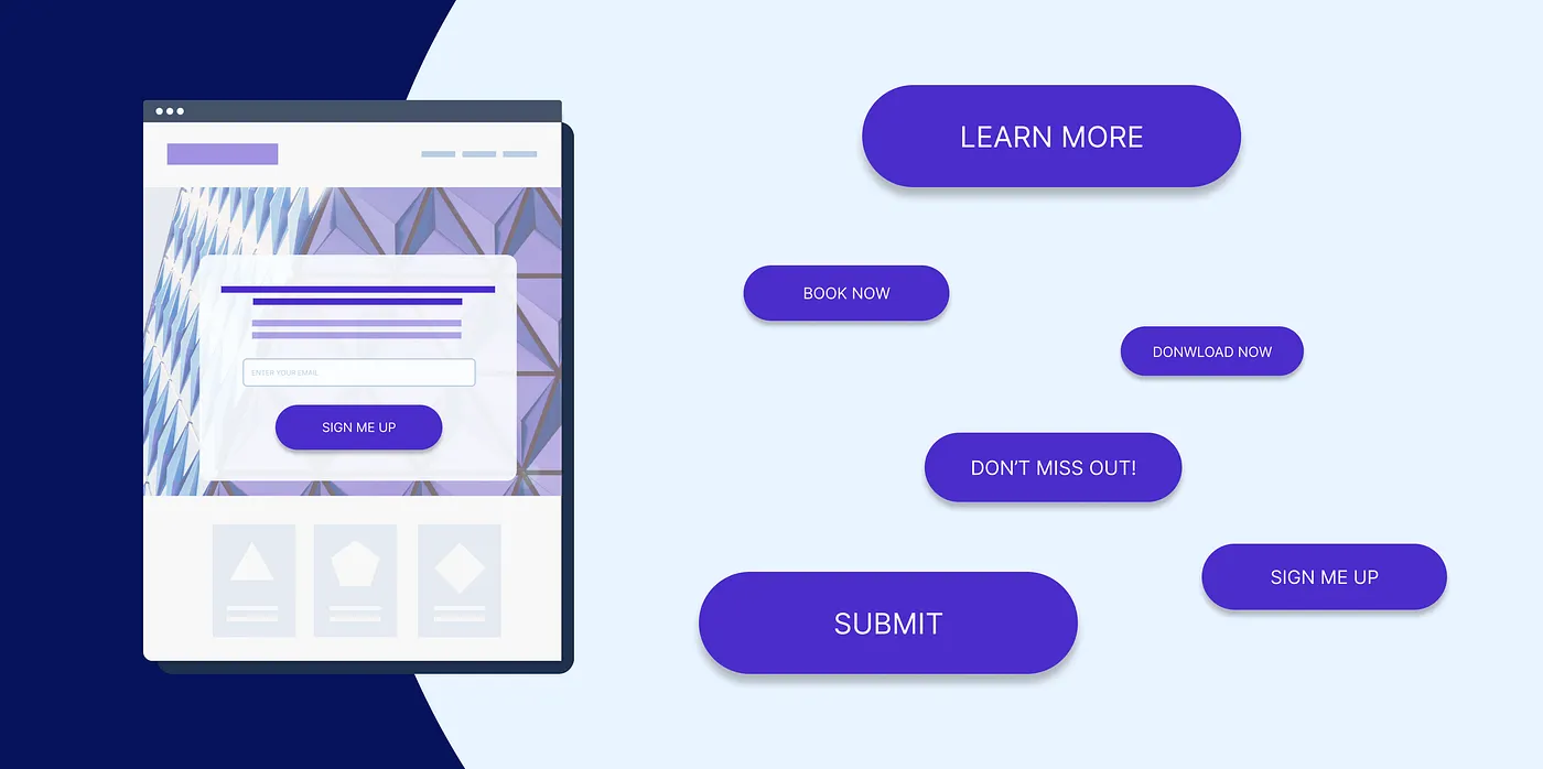
6. Social Proof Placed at the Point of Hesitation
Seen in: Stripe, Notion, Loom, ConvertKit
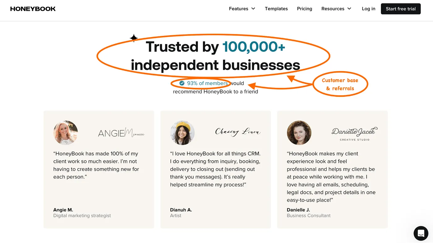
Most products put social proof in the hero section of their marketing site. That’s fine. But the most conversion-savvy SaaS products place social proof where users are about to drop off — next to the pricing toggle, beside the credit card field, above the upgrade button.
A logo strip below the hero is decoration. A “Trusted by 50,000 teams” badge next to the “Start free trial” button is persuasion.
Why it works: Users hesitate when they’re about to commit. That hesitation is a specific, predictable moment. Social proof placed at that moment does the job of a trusted friend saying “yeah, this is worth it.”
Comprehensive social proof implementation increases revenue per customer by 62%. Products with customer reviews show 270% higher purchase likelihood. And per Northwestern University research, ratings of 4.2–4.5 stars convert better than perfect 5.0 — because authenticity beats perfection.
What to copy: Audit your conversion funnel. Find the three moments where users hesitate most (usually: hero CTA, pricing page, checkout). Add specific, quantified social proof at each one. “We increased lead gen by 40%” beats “Great product!” every time.
7. Sticky Navigation with Contextual CTAs
Seen in: Webflow, HubSpot, Framer, ConvertKit
Sticky navbars are nothing new. But top SaaS products have evolved the pattern: the sticky nav changes its CTA based on where the user is on the page.
At the top, it might say “Start free.” As the user scrolls past the pricing section, it switches to “Try it free — no credit card.” After a case study section, it might show “See how [Company] did it.” The CTA stays relevant to the user’s current context.
Why it works: The further a user scrolls, the more invested they are. A generic “Sign up” CTA doesn’t reflect that investment. A contextual CTA does — it meets the user where they are and speaks to what they just read.
Using a specific, clear CTA can increase conversion rates by 161%. Tailored calls-to-action lead to a 42% higher conversion rate than generic ones.
What to copy: This requires scroll-position tracking, but the lift is significant. Start simpler: at minimum, make your sticky nav CTA copy different from your hero CTA. Give users who’ve read your whole page a reason to believe the second ask is more relevant than the first.
8. Skeleton Screens Instead of Spinners
Seen in: LinkedIn, Slack, Notion, Figma
Loading spinners communicate “wait.” Skeleton screens communicate “this is almost ready.”
A skeleton screen is a grey, low-fidelity wireframe of the content that’s loading — the shape of cards, headers, and text blocks appear before the actual content does. Users perceive this as faster loading, even when the actual load time is identical.
Why it works: It’s a perception trick grounded in psychology. Showing the structure of what’s coming keeps the user’s eye moving and their brain engaged. The uncertainty of a spinning loader triggers mild anxiety. The predictability of a skeleton screen eliminates it.
A 1-second delay in load time reduces conversions by 7%. 53% of mobile users abandon a site that takes more than 3 seconds to load. Skeleton screens don’t speed up your backend — but they meaningfully improve perceived performance.
What to copy: Replace full-page spinners with skeleton screens in any view where content takes more than 300ms to load. Match the skeleton’s layout to the actual content structure as closely as possible — the more accurate the preview, the less jarring the transition when real content appears.
9. Pricing Tables with a Clear “Recommended” Tier
Seen in: Notion, Loom, Linear, Vercel, Figma
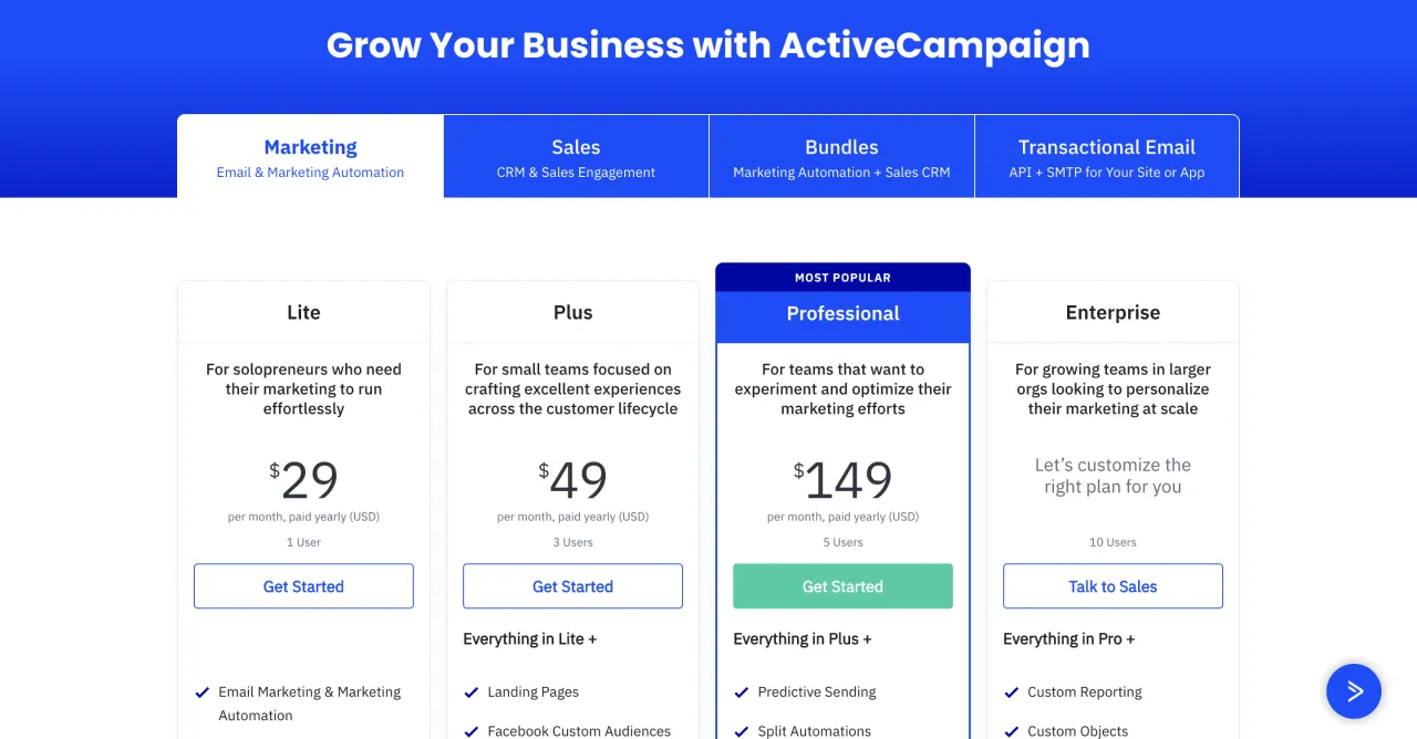
Every major SaaS pricing page highlights one tier — usually the middle one — with a visual treatment that says “this is the one most people choose.”
A darker card, a border highlight, a “Most Popular” or “Best Value” badge. The mechanics vary, but the intent is the same: reduce decision paralysis by making one option the obvious default.
Why it works: Hick’s Law states that the time it takes to make a decision increases with the number and complexity of choices. By visually elevating one option, you’re making the decision for the user without removing their agency. You’re also anchoring on the middle — making the cheaper tier look minimal and the expensive tier look unnecessary, by comparison.
72% of users abandon apps during onboarding if it requires too many steps. Decision fatigue at the pricing page has the same effect — users who can’t choose quickly often don’t choose at all.
What to copy: Add one visual distinction to your recommended tier — a highlighted border and a “Most Popular” label is enough. Consider adding a subtle note like “What most designers choose” for specificity. Never highlight more than one tier.
10. Onboarding Checklists with Progress Indicators
Seen in: HubSpot, Intercom, Loom, Notion
The onboarding checklist is one of the most powerful activation patterns in SaaS. It works because it taps directly into two cognitive biases: the Zeigarnik Effect (incomplete tasks hold more mental energy than complete ones) and the Endowed Progress Effect (showing progress makes users want to finish).
A checklist with 5 items, where 2 are already checked off, triggers more engagement than a blank checklist with 5 items — even if the first two are trivial.
HubSpot’s onboarding checklist is arguably one of the best in the industry. It’s persistent, clearly shows progress, and every item connects directly to product value.
Why it works: Progress bars and checklists “trick the brain into commitment,” as behavioral designer Nir Eyal describes it. The visual of being partway there makes completion feel inevitable rather than effortful.
Products with checklist-driven onboarding see measurable gains in activation rates. 90% of users churn without strong onboarding — the checklist is one of the most studied tools for preventing early drop-off.
What to copy: Don’t make the checklist mandatory — show it as a widget or sidebar panel. Pre-complete one or two items (like “Create your account ✓”) to trigger the endowed progress effect before users take their first real action.
11. Micro-Interactions That Confirm Action
Seen in: Stripe, Linear, Figma, Loom
img credit: uxcel
There’s a moment in every UI action where the user wonders: “Did that work?” A micro-interaction answers that question immediately, without words.
The subtle bounce when you mark a task done in Linear. The green flash when Stripe processes a payment. The satisfying animation when you “like” a comment in Notion. These animations are functional feedback — they confirm that the action was received and completed successfully.
Why it works: Without feedback, users are left uncertain. Uncertainty leads to repeated actions (double-clicking, multiple submits), confusion, and frustration. Micro-interactions close the feedback loop instantly, making the UI feel responsive and alive.
Emotion-driven UX can improve brand recall by up to 80%. Micro-interactions are the most direct way to create an emotional response at the component level — not just at the marketing level.
What to copy: Focus on three moments: form submission success, task completion, and destructive actions (deletions, cancellations). These are the highest-anxiety moments in any UI. A well-designed micro-interaction at each one significantly reduces user doubt.
12. Modular Design Systems That Ship Faster
Seen in: Stripe, Figma, Vercel, Notion
This last pattern isn’t just visual — it’s structural. The fastest-shipping SaaS teams build with modular, component-based design systems. Every UI element — cards, buttons, modals, form fields, nav bars — is a reusable component with defined variants and states.
The result: designers and developers speak the same language. There’s no “is this the old button or the new button?” The design system is the source of truth.
Why it works: Consistency builds trust. Users who move through a product and encounter consistent patterns — same spacing, same hover states, same interaction feedback — build mental models faster. They learn once, and that learning applies everywhere. This reduces cognitive friction at a systemic level.
Every $1 invested in UX returns $100 — a 9,900% ROI according to Forrester research. A design system is one of the highest-leverage UX investments a team can make, because it multiplies the quality of every screen it touches.
What to copy: Start small — a button, a card, a nav component. Build in all states (default, hover, active, disabled, loading). The goal isn’t a perfect Storybook on day one; it’s a shared vocabulary between design and development that gets more powerful over time.
If you want a head start, MadeinFigma offers production-ready Figma components and SaaS UI kits built exactly for this — so you’re not starting from zero every time.
Quick Recap
Look closely and you’ll notice something: every one of these patterns is solving the same root problem — removing friction at the moment it matters most.
Whether it’s the anxiety of a loading spinner, the confusion of an empty screen, the paralysis of too many choices, or the doubt after submitting a form — the best SaaS designers identify the friction point, then design a pattern to dissolve it.
That’s the real skill being copied. Not the visual patterns — the thinking behind them.
The next time you use a SaaS product that feels effortless, slow down and ask: what did they design away? That’s where the real craft lives.
Want ready-to-use Figma components built on these patterns? MadeinFigma has everything from SaaS UI kits to full dashboard templates — built for designers who ship.
Stay inspired every day with Muzli!