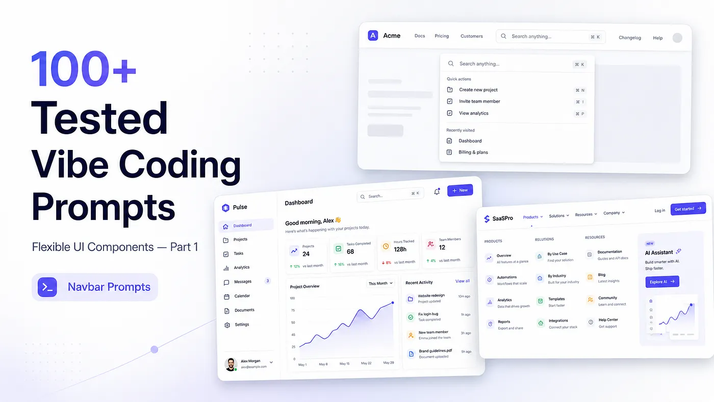
Copy now and start creating your components
Hey vibe coders 🤗,
Glad you’re here.
Nonmembers click here
Today, I’m starting a new small series where I’ll share 100+ tested vibe coding prompts that you can use to generate flexible UI components with AI.
But honestly, putting all 100 prompts in one single story would become too long, too heavy, and maybe even boring to read.
So I decided to divide this into parts.
That way, you can read one part, test the prompts, improve them, and actually use them in your own projects instead of just saving the article and forgetting about it.
In this first part, I’m sharing the first 10 prompts.
And I want to start from the place where most applications also start:
the navbar.
Because before users see your dashboard, pricing page, profile page, settings page, or product details, they usually interact with the navigation first.
A good navbar can make your app feel clean, professional, and easy to use.
A bad navbar can make even a good app feel confusing.
So in this part, we’ll start with different types of navbar prompts. After that, in the next parts, we’ll move step by step into other UI components.
So let’s start from the top of the application the navbar.
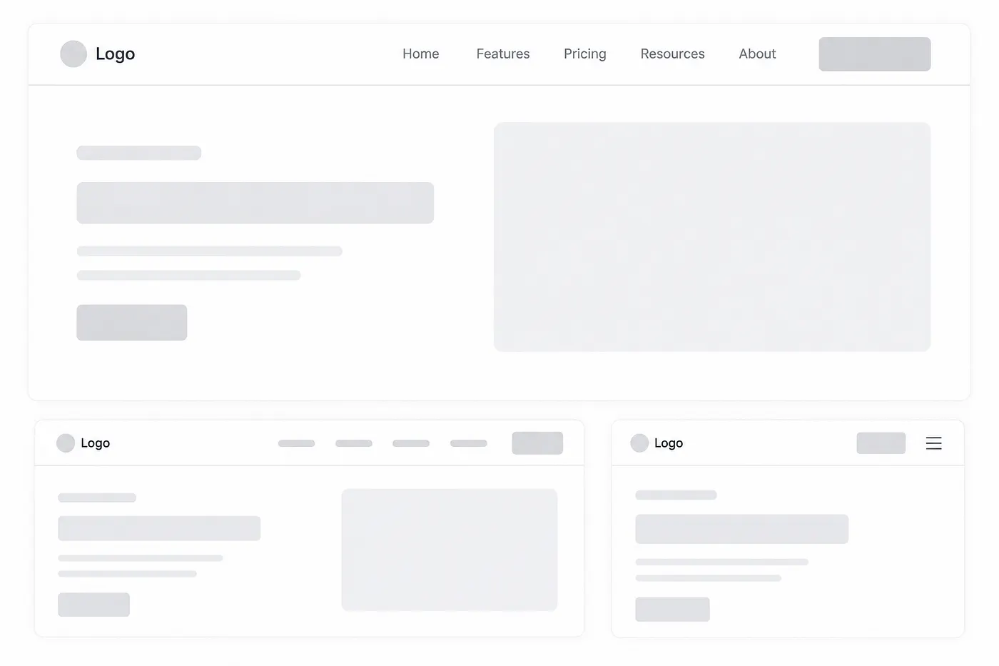
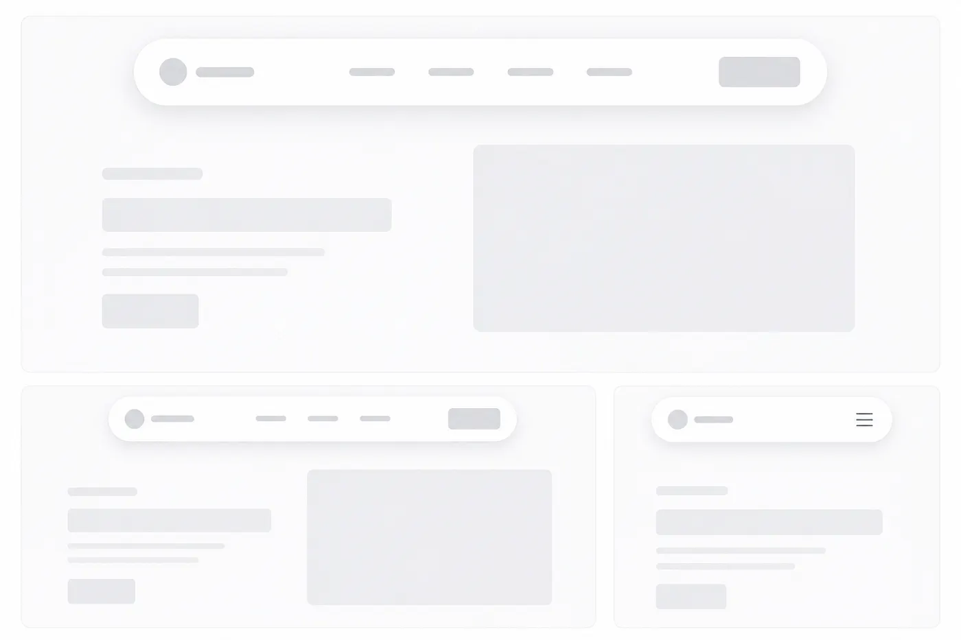
1. Simple and Minimal Logo + Links + CTA Navbar
Prompt:
Create a clean, modern, minimal horizontal navbar component for my application.

The navbar should include a logo on the left, a set of navigation links in the center or slightly toward the right, and one clear primary CTA button on the far right.

The layout should feel balanced, simple, and production-ready — not too crowded, not too decorative.

Use the existing visual style of my current UI as the main reference. Match the same color palette, typography, border radius, spacing, button style, shadows, and overall design language so the navbar feels like it naturally belongs inside the app.

The logo area should be visually clear but not oversized. Navigation links should be easy to scan, with proper spacing between each link. Add a subtle hover state for links, such as a color change, underline, background highlight, or smooth transition depending on the app’s style.

The CTA button should stand out slightly more than the links, but it should not feel too aggressive. It should use the primary brand color or the existing button style from the UI.

Make the navbar responsive:

On desktop, show the full horizontal layout.
On tablet and mobile, collapse the links into a clean menu button or mobile drawer.
Keep the CTA visible if space allows, otherwise place it inside the mobile menu.

Use clean, reusable component structure and avoid unnecessary complexity. The final result should look polished, lightweight, and suitable for a real SaaS, dashboard, portfolio, startup website, or modern web app.
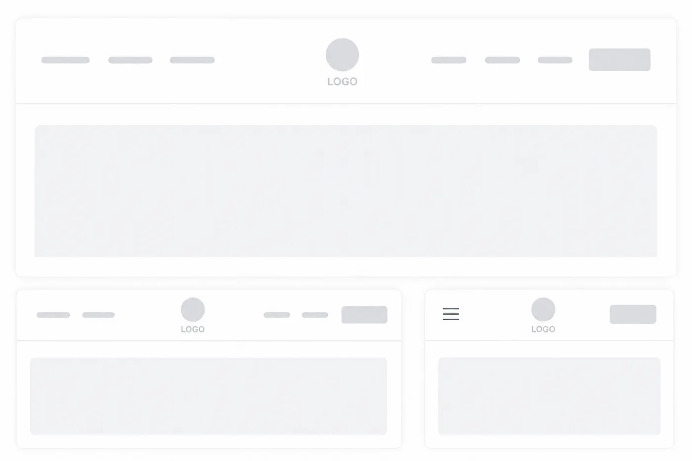
2. Centered Logo Split Navbar
Prompt:
Create a clean, modern navbar component with the logo perfectly centered in the middle of the navigation bar.

Split the navigation links evenly on both sides of the logo. For example, place 2–3 links on the left side and 2–3 links on the right side so the layout feels balanced and symmetrical.

The navbar should feel elegant, minimal, and visually calm. It should work well for a modern website, SaaS landing page, portfolio, agency site, luxury brand, personal brand, or creative product website.

Use my existing UI as the main design reference. Match the current color palette, typography, spacing, border radius, shadows, button style, hover states, and overall visual aesthetic so the navbar feels like a natural part of the interface.

The logo should be the visual center of the navbar, but it should not look oversized. Keep it clean and readable. Navigation links should have consistent spacing, proper alignment, and subtle hover effects such as a soft color change, underline animation, background pill highlight, or smooth transition based on the existing design style.

The layout should be fully responsive:

On desktop, show the full split navigation layout with the logo centered.

On tablet, reduce spacing smoothly while keeping the centered logo structure clean.

On mobile, collapse the navigation links into a hamburger menu or slide-down menu. Keep the logo centered or slightly adjusted depending on the best mobile layout.

Make sure the navbar does not feel crowded. Use clean component structure, accessible link labels, smooth transitions, and responsive spacing.

The final output should look polished, balanced, reusable, and production-ready. It should feel like a premium centered navigation header that fits naturally inside my current UI.
3. Floating Pill Navbar
Prompt:
Create a modern floating pill-style navbar for my application.

The navbar should be horizontally centered and slightly detached from the top edge of the page, instead of being stuck directly to the top. It should look like a soft rounded pill floating above the page content.

Use a fully rounded container with smooth corners, balanced padding, and a subtle shadow so the navbar feels elevated but not too heavy. The design should look clean, premium, lightweight, and modern.

The navbar should include a clear logo or brand name, navigation links, and an optional CTA button depending on the existing UI structure.

Match the visual style of my current interface. Use the same color palette, typography, border radius, spacing, shadows, button style, hover effects, and overall design language so the navbar feels naturally connected to the rest of the app.

The floating pill should not be too tall or too wide. Keep the layout compact and elegant. Navigation links should have clean spacing and subtle hover states such as soft background highlight, color change, underline animation, or pill-style active state.

The CTA button, if included, should fit naturally inside the pill navbar. It should stand out slightly but still feel minimal and balanced.

Make the navbar responsive:

On desktop, show the full floating pill navigation centered at the top.

On tablet, reduce spacing and keep the pill layout clean without crowding.

On mobile, convert the navigation into a compact pill header with logo and menu icon, then open links inside a dropdown, drawer, or expanded floating panel.

Keep the floating effect consistent across screen sizes. Avoid harsh shadows, oversized spacing, or overly decorative effects.

The final output should look polished, responsive, reusable, and production-ready. It should feel suitable for a modern SaaS landing page, AI tool, portfolio website, creative studio site, startup homepage, or premium web application.
4. Transparent Over Hero Navbar
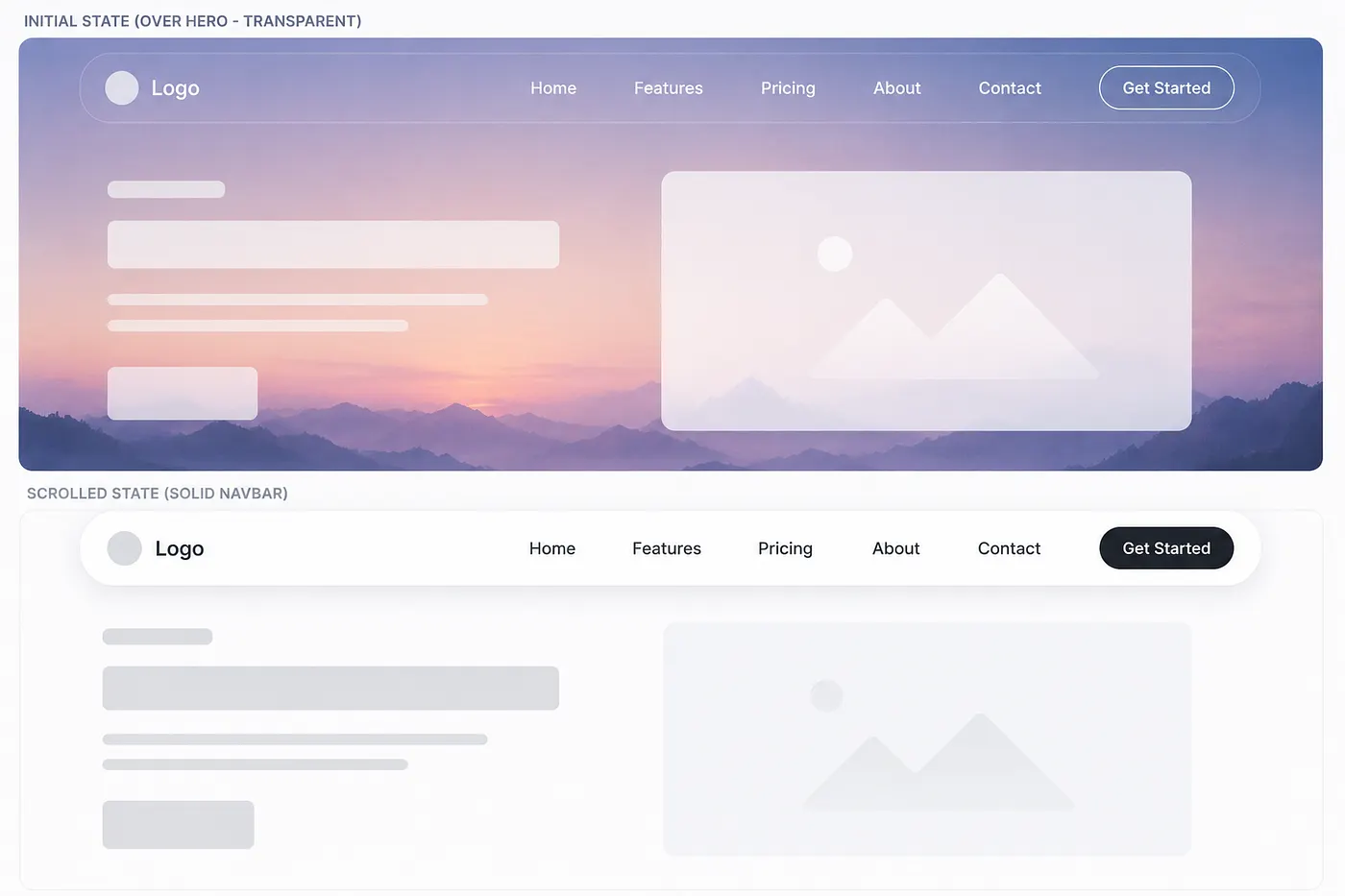
Prompt:
Create a modern navbar component that sits transparently over the hero section when the page first loads.

The navbar should be positioned at the top of the page and layered above the hero content. In its initial state, it should feel lightweight and transparent, allowing the hero background to remain visible behind it.

When the user scrolls down, the navbar should smoothly transition into a solid or semi-solid header background. Add a subtle shadow, blur, border, or backdrop effect only after scrolling so the navbar remains readable and separated from the page content.

Match the visual style of my existing UI. Use the same color palette, typography, spacing, border radius, shadows, button styles, hover states, and overall design language so the navbar feels naturally connected to the rest of the interface.

The navbar should include a clear logo or brand name, navigation links, and an optional CTA button if it fits the current layout.

In the transparent hero state:

Keep the navbar clean and readable.

Use text colors that contrast properly with the hero background.

Avoid heavy borders or shadows.

Let the hero section feel open and immersive.

In the scrolled state:

Change the navbar background to match the app’s surface color.

Add a subtle shadow, border, or backdrop blur.

Keep the transition smooth and polished.

Make the navbar feel stable and easy to read.

Add smooth transitions for background color, text color, shadow, border, and blur so the change does not feel sudden.

Make the navbar responsive:

On desktop, show the full navigation layout.

On tablet, adjust spacing and keep the navbar readable.

On mobile, use a clean menu icon with a dropdown, drawer, or slide-down menu.

Make sure the mobile menu also works well over the hero section and after scroll.

Use clean, reusable component structure and keep the logic simple. The final result should look polished, responsive, and production-ready for a landing page, SaaS homepage, portfolio, agency website, AI product site, or modern web application.
5. Command-Palette Navbar
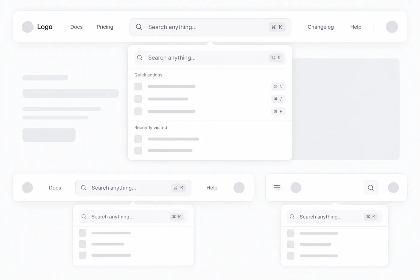
Prompt:
Create a modern navbar component where the main focus is a prominent search or command-palette input in the center of the navbar.

The navbar should feel clean, developer-friendly, and highly usable. The search input should look like a command palette trigger, similar to modern apps where users can press ⌘K or Ctrl + K to quickly search, navigate, or open actions.

Place the logo or brand name on the left side. Keep only a few minimal navigation links, icons, or actions around the search input so the navbar does not feel crowded.

The command-palette input should be the central visual element. It should include a placeholder like:

Search anything...
or
Search docs, pages, components...

Add a small keyboard shortcut badge on the right side of the input, such as ⌘K or Ctrl K, depending on the platform style.

Match the visual style of my existing UI. Use the same colors, typography, spacing, border radius, shadows, borders, icon style, hover states, and overall design language so the navbar feels naturally connected to the rest of the application.

The search input should feel interactive and polished. Add subtle details like:

soft border or background
hover state
focus ring
smooth transition
search icon on the left
keyboard shortcut badge on the right
optional backdrop blur if it matches the UI

When the user clicks the search input or presses ⌘K / Ctrl + K, open a clean command palette modal or dropdown. The command palette should include search suggestions, recent pages, quick actions, or navigation items.

Make the navbar responsive:

On desktop, keep the command-palette input large and centered.

On tablet, reduce the input width while keeping it usable.

On mobile, replace the large input with a compact search icon or small command button that opens the same command palette.

Keep the layout clean, accessible, and keyboard-friendly. The final output should look polished, reusable, and production-ready for a SaaS dashboard, developer tool, documentation website, AI app, admin panel, productivity app, or modern web application.
6. Bottom Mobile Navbar
Prompt:
Create a modern bottom tab bar navigation for a mobile app-style interface.

The navigation should be fixed to the bottom of the viewport and always visible while the user scrolls. It should feel like a native mobile app tab bar, with clear icons and short labels for each navigation item.

Use 4–5 main navigation items only, such as:

Home, Search, Dashboard, Saved, Profile

Each tab item should include:

a simple icon
a short label
clear active state
subtle inactive state
smooth tap or hover feedback

The active tab should be visually clear using the existing brand color, filled icon, soft background pill, underline indicator, or any style that matches the current UI. Inactive tabs should feel muted but still readable.

Match the visual style of my existing UI. Use the same colors, typography, spacing, border radius, icon style, shadows, borders, blur effects, and overall design language so the bottom nav feels naturally connected to the app.

The tab bar should have a polished mobile-first layout:

fixed at the bottom
full-width or slightly inset with rounded corners
safe-area padding for modern phones
balanced icon and label spacing
comfortable tap targets
subtle top border, shadow, or backdrop blur
no overcrowding

Make sure the design works well on different mobile screen sizes. The bottom nav should not cover important page content, so add proper bottom padding to the main page layout.

If the app already has a top navbar on desktop, keep this bottom tab bar only for mobile screens. On tablet or desktop, hide the bottom navigation and use the normal navbar instead.

The final output should look clean, responsive, accessible, reusable, and production-ready for a mobile web app, SaaS dashboard, productivity app, social app, finance app, e-commerce app, or AI-powered mobile interface.
7. Sidebar Navbar
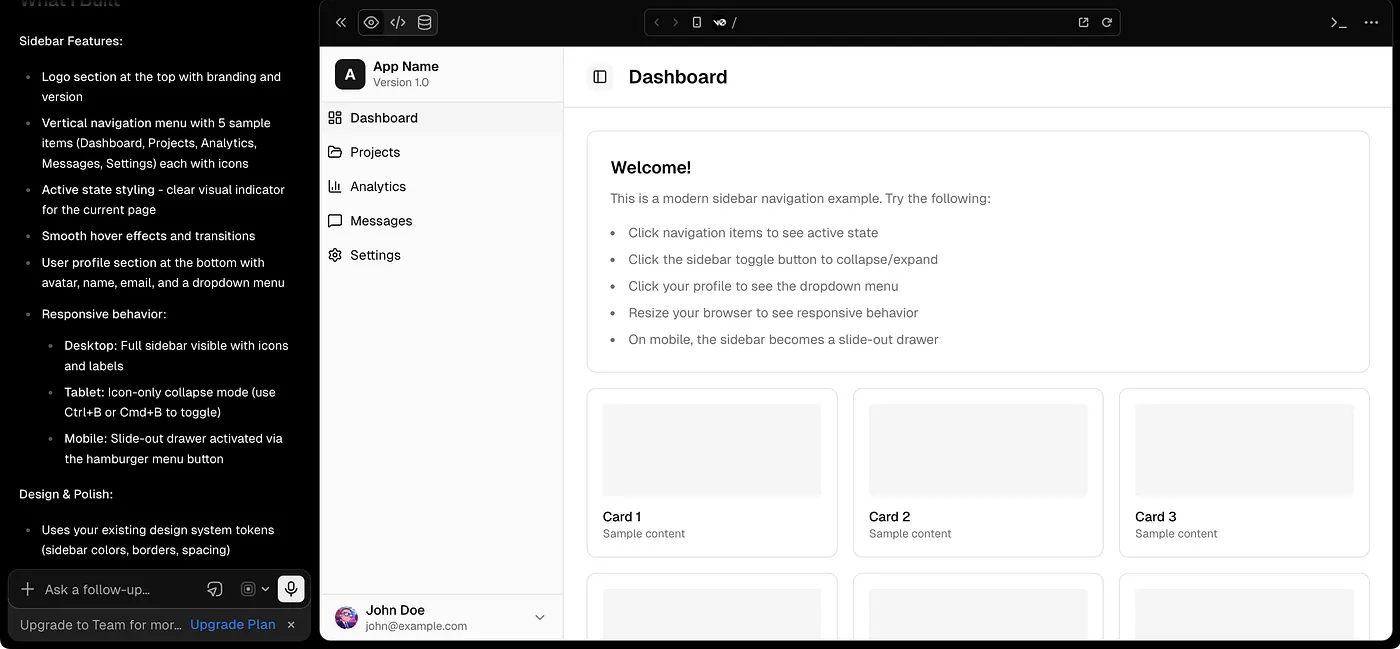
Prompt:
Create a clean, modern vertical sidebar navigation for my application.

The sidebar should be placed on the left side of the page and should act as the main navigation area for a dashboard, admin panel, SaaS app, productivity app, AI tool, or internal web application.

Place the logo or brand name at the top of the sidebar. Below the logo, stack the navigation links vertically with clear spacing and strong readability.

The navigation links should include an icon and label for each item. Example items can be:

Dashboard, Projects, Analytics, Messages, Settings

Each navigation item should have:

a clear icon
readable label
active state
hover state
proper spacing
smooth transition

The active link should be easy to recognize using the existing brand color, soft background highlight, left border indicator, filled icon style, or pill-style selection depending on the current UI style.

At the bottom of the sidebar, add a user/account section. This section should include a small avatar, user name, email or role text, and an optional settings or dropdown icon. Keep it compact and aligned with the overall sidebar design.

Match the visual style of my existing UI. Use the same color palette, typography, spacing, border radius, shadows, borders, icon style, hover states, and overall design language so the sidebar feels like a natural part of the app.

Make the sidebar layout polished and practical:

fixed or sticky on desktop
full-height layout
logo section at the top
navigation links in the middle
user/account area pinned at the bottom
subtle border or background separation
enough padding for comfortable scanning
clean active and hover states

Make it responsive:

On desktop, show the full sidebar with icons and labels.

On tablet, optionally collapse the sidebar into an icon-only rail.

On mobile, hide the sidebar behind a menu button and open it as a slide-out drawer.

Make sure the main content area adjusts properly when the sidebar is visible, collapsed, or hidden.

The final output should look clean, accessible, reusable, responsive, and production-ready. It should feel suitable for a modern SaaS dashboard, admin panel, CRM, AI workspace, analytics platform, or productivity web app.
8. Mega Menu Navbar
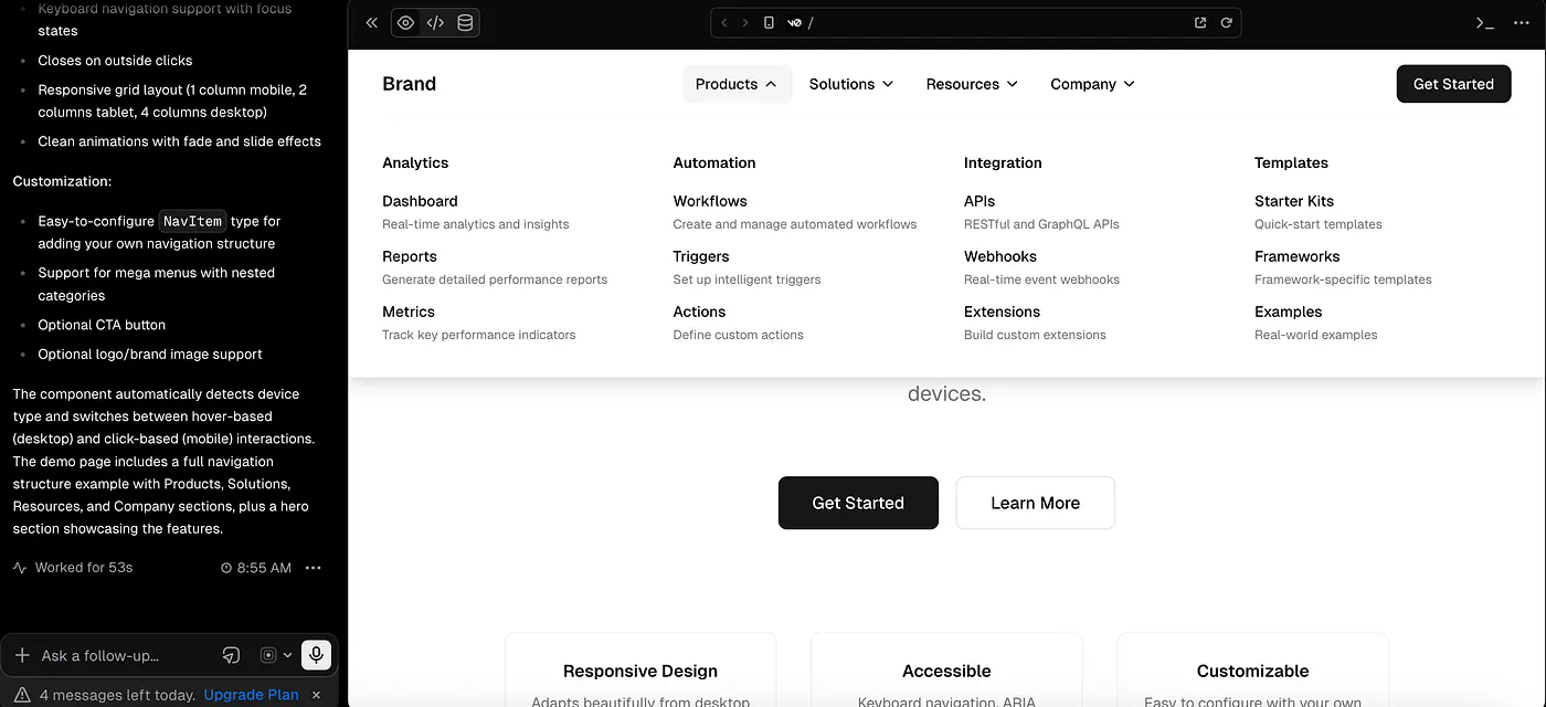
Prompt:
Create a modern navbar component with a full-width mega menu dropdown.

The navbar should include a logo or brand name on the left, top-level navigation links in the center or right, and an optional CTA button on the far right.

When the user hovers over or clicks a specific top-level navigation link, show a wide mega menu dropdown that expands below the navbar. The dropdown should span most of the page width or align neatly with the main content container.

The mega menu should include categorized sub-links instead of a simple vertical list. Organize the content into clear sections such as:

Products, Solutions, Resources, Company

Each category should include multiple sub-links with short descriptions. For example:

Analytics
Track performance and user behavior.

Automation
Create workflows and save time.

Templates
Start faster with ready-made layouts.

Add optional visual elements inside the mega menu, such as a small feature card, preview image placeholder, icon grid, highlighted product card, or “Featured” section. Keep these visuals minimal and useful, not decorative or crowded.

Match the visual style of my existing UI. Use the same color palette, typography, spacing, border radius, shadows, borders, icons, hover states, button style, and overall design language so the mega menu feels naturally connected to the application.

The mega menu should feel polished and easy to scan:

clear category headings
neat column-based layout
readable link descriptions
enough spacing between groups
subtle hover state for each menu item
smooth open and close animation
soft shadow or border for dropdown separation
no clutter or overwhelming design

The navbar should support both hover and click behavior where appropriate. On desktop, hovering over the top-level item can reveal the mega menu. On touch devices, tapping the item should open and close the menu.

Make it responsive:

On desktop, show the full-width mega menu with categorized columns.

On tablet, reduce the number of columns or stack sections neatly.

On mobile, convert the mega menu into an accordion-style mobile menu where each top-level category can expand to show its sub-links.

Make sure the dropdown is keyboard-accessible, closes when clicking outside, and does not cover content in a broken way.

The final output should look clean, premium, responsive, reusable, and production-ready. It should be suitable for a SaaS landing page, enterprise website, AI tool, developer platform, marketplace, documentation site, or modern product website.
9. Minimal Auth Navbar
Prompt:
Create a clean, minimal authentication navbar for a login, signup, onboarding, or account access page.

The navbar should be simple and distraction-free. Place the logo or brand name on the left side and keep the right side focused on auth-related actions like:

Sign in, Create account, Get started, or Back to home

Avoid too many navigation links because this navbar is mainly for conversion-focused pages where the user should complete one clear action.

Match the visual style of my existing UI. Use the same colors, typography, spacing, border radius, button style, shadows, borders, and overall design language so the navbar feels naturally connected to the rest of the app.

The CTA button should be clear but not too loud. If the page is a login page, show “Create account” as the main CTA. If the page is a signup page, show “Sign in” as a secondary action.

Make the navbar responsive:

On desktop, keep the logo on the left and auth actions on the right.

On mobile, keep the layout compact with logo and one main action only.

The final output should look clean, focused, lightweight, and production-ready for SaaS apps, AI tools, dashboards, landing pages, and product onboarding flows.
10. Dashboard Topbar Navbar
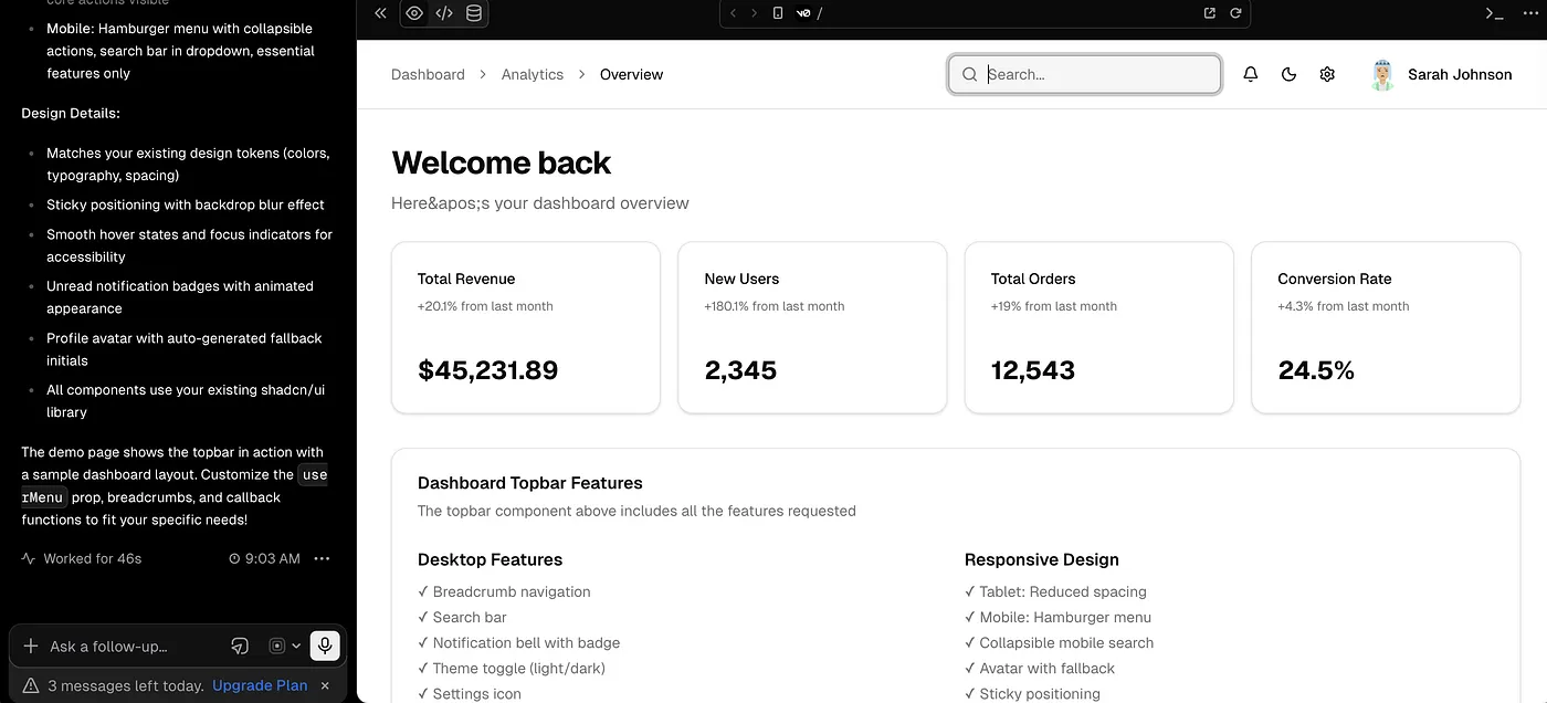
Prompt:
Create a modern dashboard topbar navbar for a web application.

The navbar should sit at the top of the main content area and work as a utility header for a dashboard, SaaS app, admin panel, AI workspace, CRM, analytics tool, or productivity app.

Include a clean page title or breadcrumb on the left side. In the center or right side, add useful dashboard actions such as:

Search input, notification icon, theme toggle, settings icon, and user profile dropdown

The layout should feel practical, clean, and not overcrowded. The search input should be easy to notice but not dominate the full navbar unless the existing UI style requires it.

Match the visual style of my existing UI. Use the same color palette, typography, spacing, border radius, shadows, borders, icon style, hover states, and overall aesthetic so the topbar fits naturally inside the app.

The profile menu should include a small avatar and optionally open a dropdown with items like:

Profile, Settings, Billing, Help, and Logout

Add subtle interaction states:

hover effects on icons, focus state for search, unread badge on notification, smooth dropdown animation, and clear active states where needed.

Make it responsive:

On desktop, show the full topbar with search and actions.

On tablet, reduce spacing and hide less important labels.

On mobile, keep only the most important actions visible and move the rest into a menu or drawer.

The final output should look polished, reusable, accessible, and production-ready for a real dashboard-style application.
And that’s it for Part 1.
In this first part, we started from the top of almost every application the navbar.
I shared different navbar prompt ideas, from a simple logo-and-links layout to floating navbars, command-palette navbars, sidebar navigation, mega menus, and mobile bottom tab bars.
The main goal of this series is not just to collect prompts.
The goal is to create prompts that are actually useful when you are vibe coding with AI and trying to build real UI components faster.
You can copy these prompts, change small details based on your project, and test them in your favorite AI coding tool.
And as always, don’t treat these prompts like final rules. Use them as a strong starting point, then adjust the design, spacing, colors, and interactions according to your own app.
In the next part, we’ll move one step deeper into the page.
We’ll start with one of the most important sections of any website or app landing page:
the hero section.
Because after the navbar, this is usually the first area that decides whether a user feels interested or leaves the page.
So in Part 2, we’ll explore different hero section prompts that can help you generate clean, modern, flexible, and conversion-friendly hero layouts.
Thanks for reading till the end.
Editor’s Note : This story includes AI-generated content such as prompt templates and AI-generated images used for demonstration and creative experimentation. The prompts shared in this story were developed through my own testing and exploration. And there is no any affiliate or promotional links. Everything based on personal experience and research🤗.